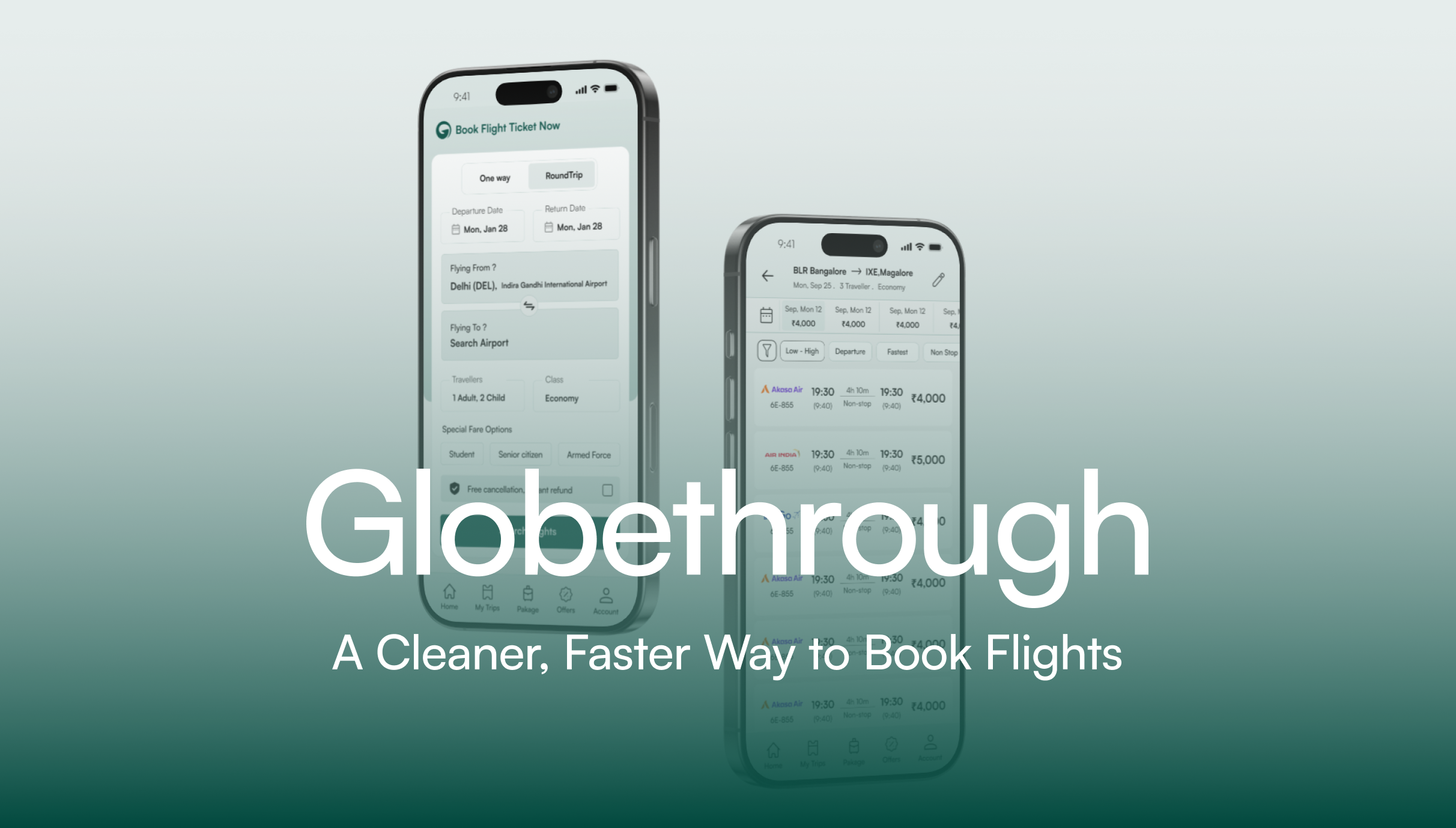
Globethrough.
Research Strategy Solutions Product Back to Portfolio
Portfolio / Globethrough
Product Design Mobile App 2024

Globethrough

A cleaner, faster way to book flights

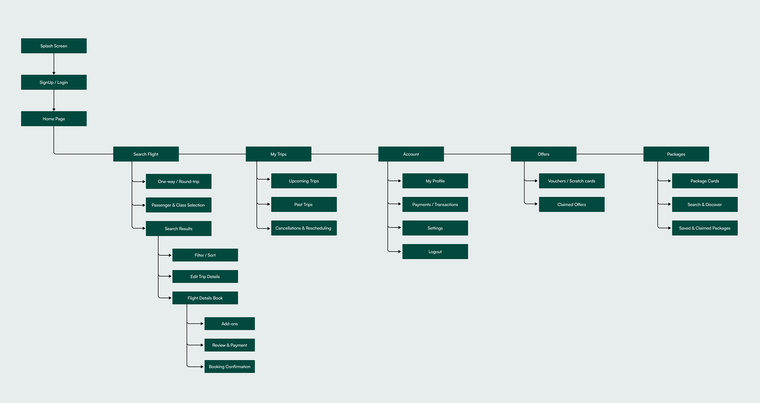
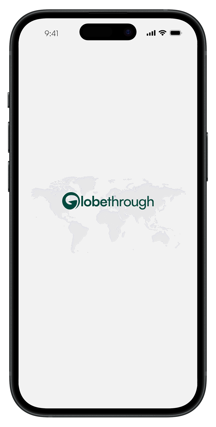
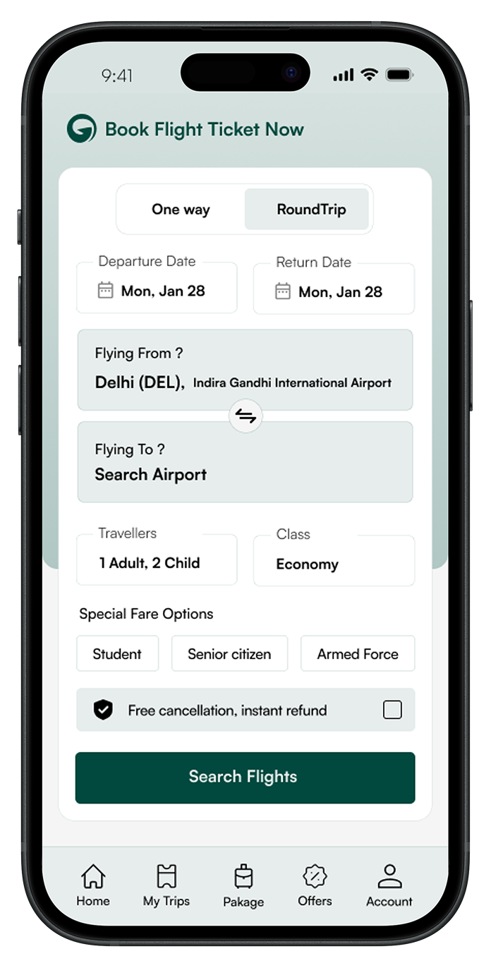
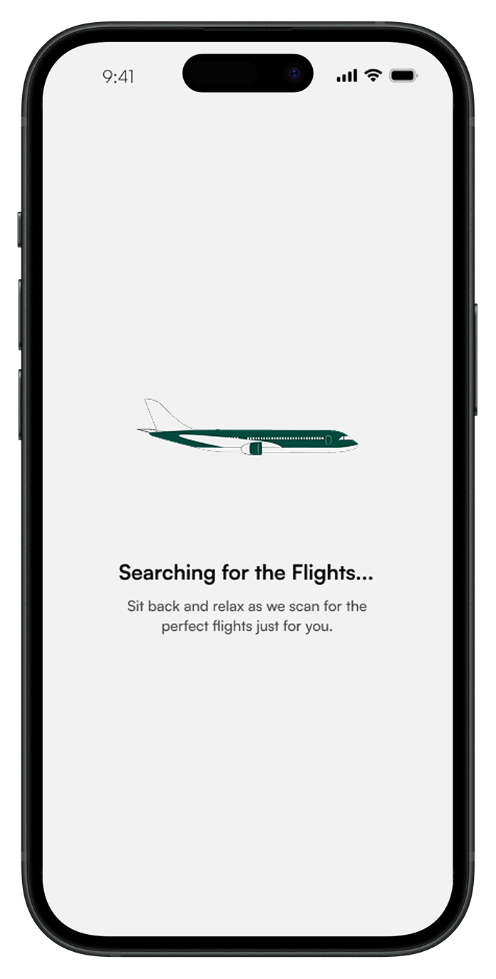
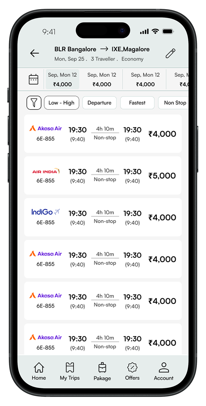
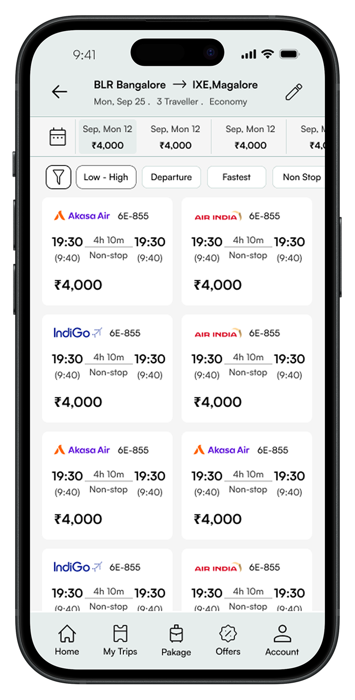
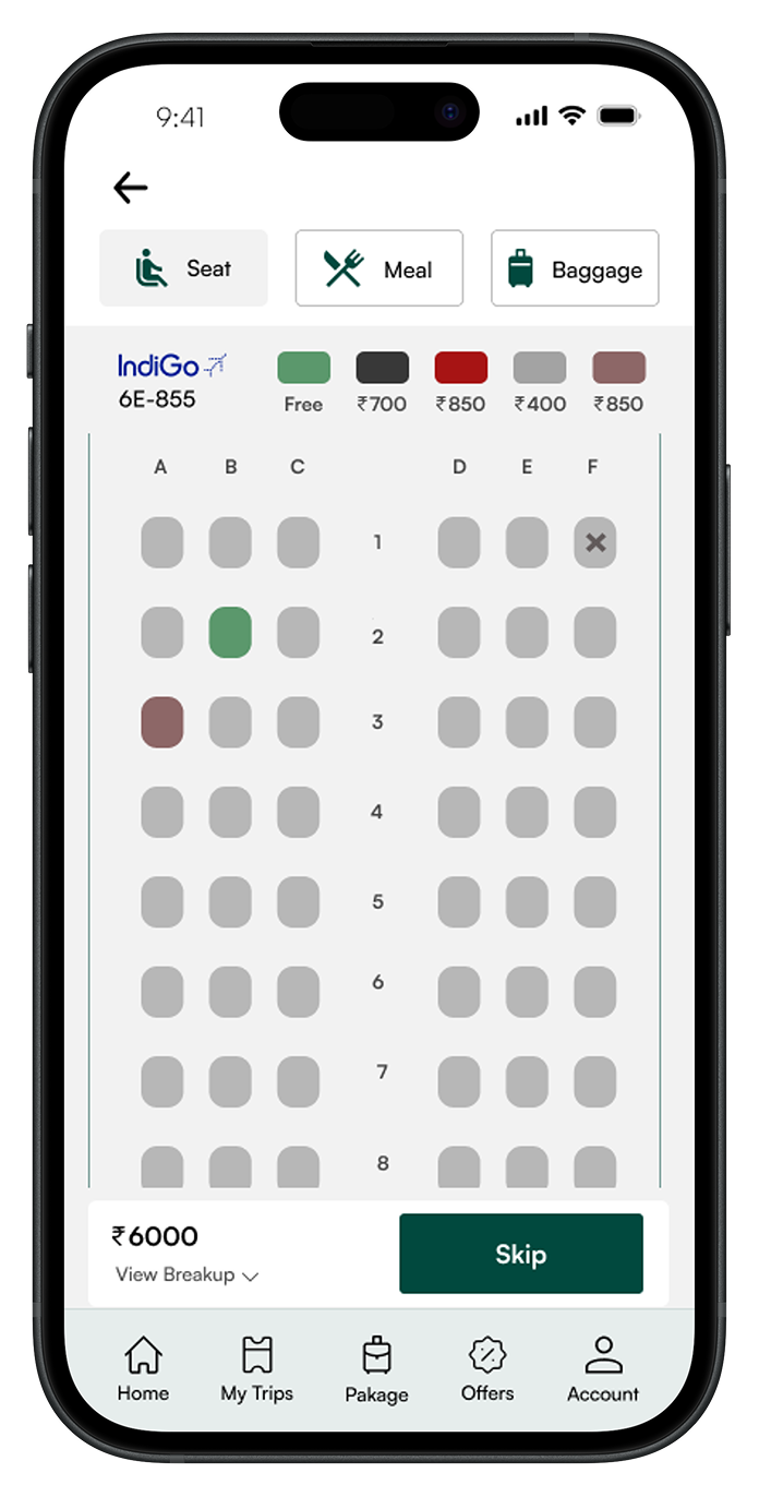
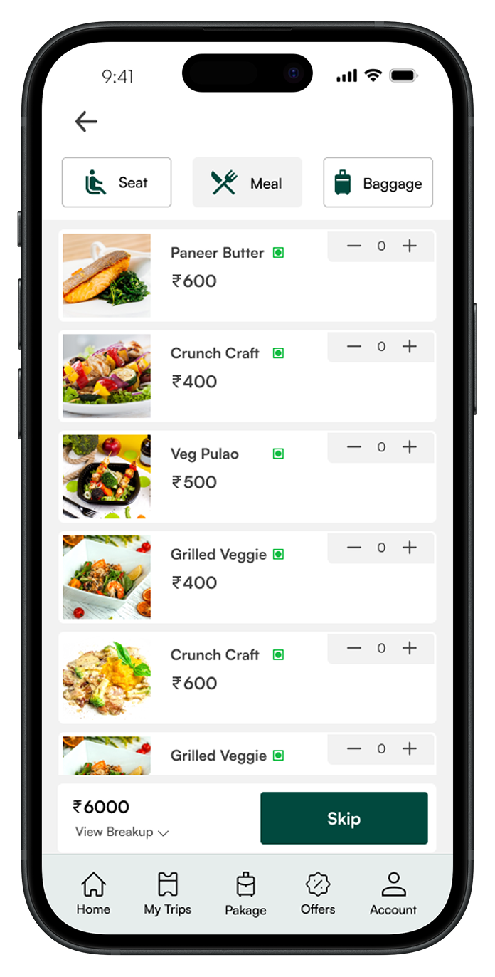
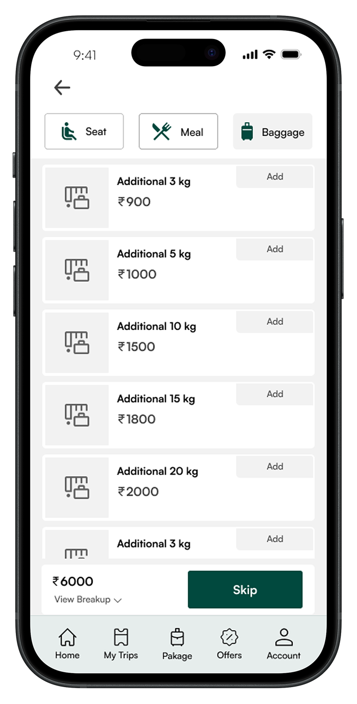
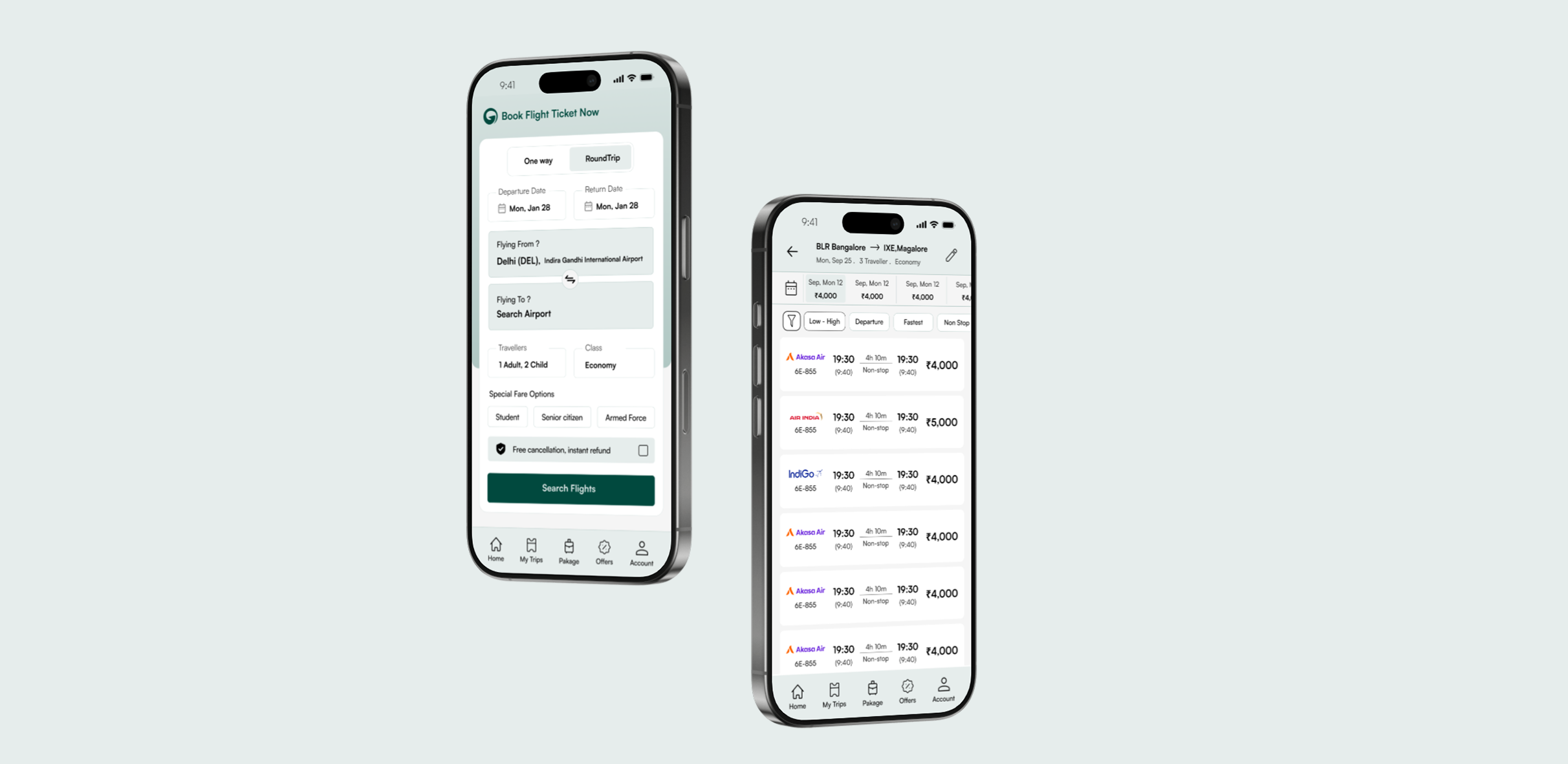
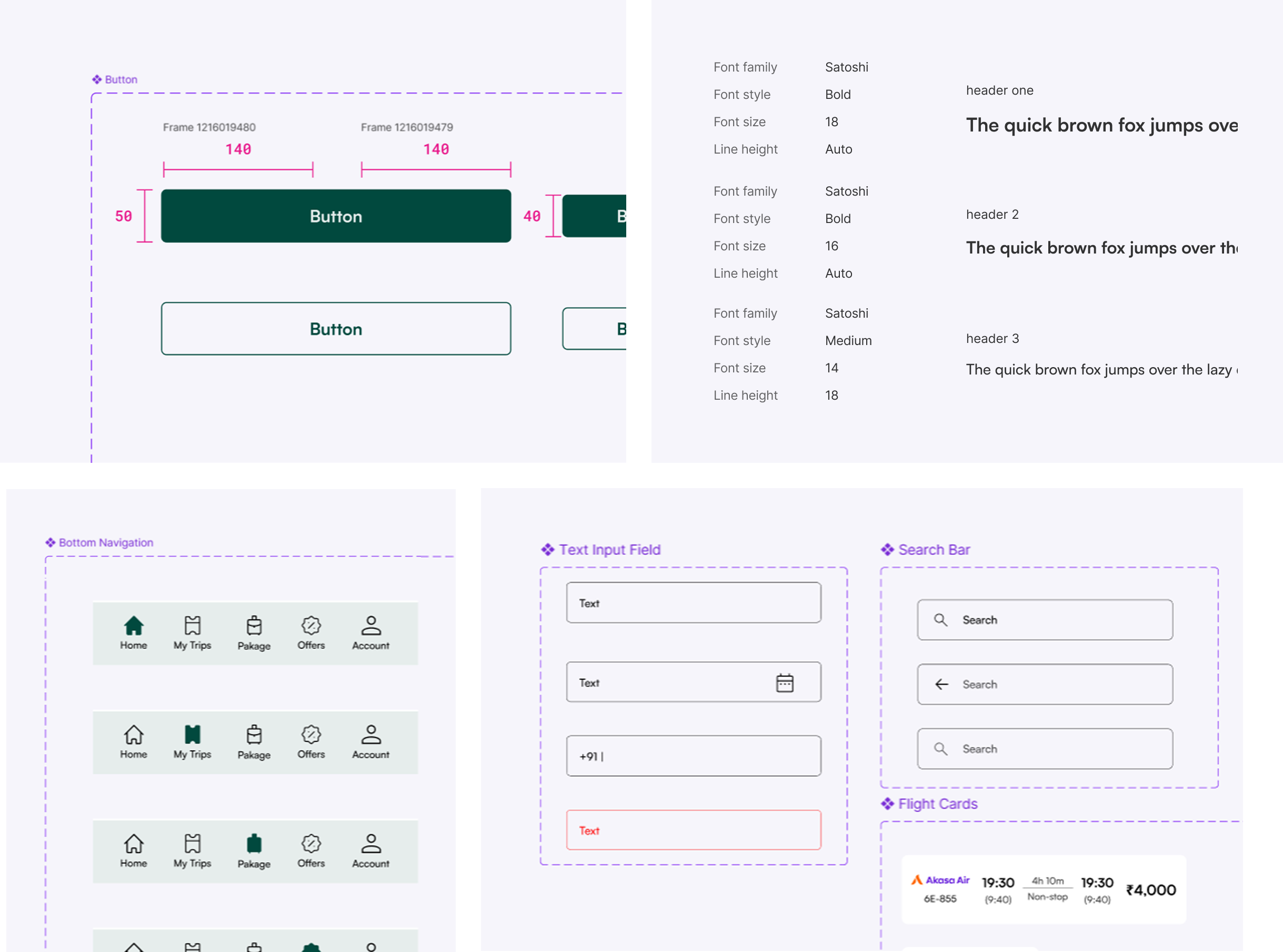
The existing flight booking experience was cluttered, confusing, and full of hidden costs. I led the end-to-end design — from user research and survey analysis to information architecture, component library, and high-fidelity screens — creating a booking flow that users could trust and complete in under 2 minutes.

85% Task Success
15+ Screens
4 Step Booking
Sole Designer
User Research Survey Design Information Architecture Booking Flow Component Library UI Design Usability Testing
Globethrough — Flight Booking App Mockups
01 Research
02 Strategy
03 Solutions
04 Outcome

What the project needed

Globethrough is a flight booking platform built for the Indian market. The existing app had a functional backend but the user experience was fragmented — cluttered UI, confusing navigation, and a booking flow that made users abandon mid-way. I was brought in to redesign the entire experience from the ground up.

The original ask

Redesign the flight booking app. Make it cleaner and easier to use than competitors like MakeMyTrip, Yatra, and Ixigo.

What I delivered

User research with 100+ survey responses, information architecture, a modular component library, a streamlined 4-step booking flow with 85% task success rate, and 15+ high-fidelity screens ready for development.

What 100+ users told me about flight booking

Before designing anything, I conducted a survey with over 100 respondents to understand the real pain points of booking flights in India. The results shaped every design decision that followed.

73%

I've experienced sudden price jumps or hidden charges at the last step of booking.

Yes 73% No 27%
74%

I get bombarded with fake alerts or unnecessary add-ons I don't want.

Yes 74% No 26%
66%

I don't trust the final amount on screen — it keeps changing or doesn't include all charges.

Yes 66% No 34%
60%

I feel overwhelmed by messy flight apps full of too many tabs, banners, and distractions.

Yes 60% No 40%
60%

Flight apps rarely help when something goes wrong — I'm left figuring it out myself.

No 60% Yes 40%
69%

Booking a flight feels like a long process with too many steps and repeating the same info.

No 69% Yes 31%

The research made one thing clear: Users don't want more features. They want pricing they can trust, a clean interface without dark patterns, and a booking flow that doesn't waste their time. These three pillars drove every design decision.

The insights that shaped the product direction

01
From survey data — 73% experienced hidden charges

Price transparency is the #1 trust signal — show the real cost from the start

Nearly 3 out of 4 users reported experiencing sudden price jumps at the last step. Competitors use this as a dark pattern to lock users in. Globethrough's approach: show the complete price breakdown from the search results page itself. No surprise charges at checkout. The price you see is the price you pay.

02
From survey data — 74% complained about fake alerts

Remove every dark pattern — no fake urgency, no pre-selected add-ons

Users are exhausted by "Only 2 seats left!" countdown timers and pre-checked insurance boxes. Globethrough takes the opposite approach: no fake scarcity alerts, no pre-selected add-ons, no manipulative UI. Add-ons like meals, seats, and baggage are presented clearly with a "Skip" option that's just as prominent as the "Add" button.

03
From UI audit of competitors

Clean visual hierarchy — one action per screen, not ten

Competitor apps cram promotional banners, loyalty program upsells, and cross-sells onto every screen. The user's primary task — finding and booking a flight — gets buried. Globethrough's design principle: every screen has one primary action. Search. Compare. Select add-ons. Pay. Nothing else competes for attention.

04
From booking flow analysis

A 4-step booking flow reduces cognitive load and prevents drop-offs

Competitors require 6–8 steps to complete a booking, with redundant data entry and confusing back-navigation. I designed Globethrough's flow in 4 steps: Search → Select flight → Choose add-ons (seat/meal/baggage) → Review & Pay. Each step has clear progress indication and allows easy backtracking. This achieved an 85% task success rate in usability testing.

How the app is structured and why

The IA was designed around user intent, not feature count. The bottom navigation has 5 core destinations — Home, My Trips, Packages, Offers, and Account — each serving a distinct user need. The booking flow is intentionally linear to prevent confusion.

Globethrough — Information Architecture Diagram

Why this structure works: The core booking flow (Search → Results → Flight Details → Add-ons → Payment → Confirmation) is completely linear — no branching, no dead ends. This reduced the average booking time and prevented the confusion caused by nested navigation in competitor apps.

4 steps from search to confirmation

Every competitor makes the booking flow feel long. I simplified it into 4 clearly defined steps. Each step has one primary action — no distractions, no upsells cluttering the path.

01
Search
One-way or round-trip. Departure, destination, dates, travellers, class. Special fare options for students, senior citizens, armed forces.
02
Compare & Select
Filter by price, departure time, fastest, non-stop. Sort and compare across airlines. Date-wise pricing strip for flexible travellers.
03
Add-ons
Seat selection, meal preferences, baggage — each in its own tab. "Skip" is always as prominent as "Add". Running total with View Breakup.
04
Review & Pay
Complete price breakdown. No hidden fees. Free cancellation and instant refund options clearly presented before payment.

The decisions that shaped the product

Decision 01 Pricing

Show the complete fare from the search results — no "convenience fees" at checkout

Every price shown in the search results includes all taxes and fees. The "View Breakup" button on the add-ons page shows exactly what each component costs. Users never see a different number at checkout than what they expected. This directly addresses the #1 complaint from the survey (73% experienced hidden charges).

Trade-off: Higher displayed prices in search results compared to competitors who show base fares. But transparent pricing builds trust — and trust converts better than bait-and-switch tactics.
Decision 02 Add-ons

Tabbed add-on selection with equal-weight Skip and Add buttons

Seat, Meal, and Baggage are separated into tabs — not crammed onto one screen. Each tab has a clear "Skip" button that's styled the same as the proceed button. Nothing is pre-selected. The running total at the bottom always shows "View Breakup" so users know exactly what they're paying for.

Trade-off: Lower add-on attach rates compared to dark-pattern competitors. But users who choose to add extras do so intentionally — leading to fewer cancellations and refund requests.
Decision 03 Search Results

Date-wise pricing strip + smart filters above fold

A horizontal scrollable strip shows prices across dates, so flexible travellers can spot the cheapest option instantly. Below that, filter chips (Low-High, Departure, Fastest, Non-stop) are visible without opening a modal. This reduces the number of interactions needed to find the right flight from 5+ to 2.

Trade-off: More vertical space used above the fold. But users make decisions faster when comparison data is immediately visible, not hidden behind filter menus.
Decision 04 Visual Design

Clean white interface with deep teal accents — no visual noise

Competitors use vibrant gradients, promotional banners, and animated badges everywhere. Globethrough uses a clean white background with deep teal (#0B4D3C) as the only accent color. The result: the user's eye goes directly to flight information instead of being pulled toward ads and promotions. Typography uses the Satoshi font family for a modern, readable feel.

Trade-off: Less visual "excitement" compared to competitors. But the calm interface reduces cognitive load during a task that involves comparing numbers and making financial decisions.

Screens from the final design

Splash Screen & Home — First Impressions

The splash screen features the Globethrough logo centered over a subtle world map — clean and confident. The home screen leads with "Book Flight Ticket Now" and a one-way/round-trip toggle. Every input field (dates, airports, travellers, class) is immediately visible — no progressive disclosure for the primary task.

Globethrough Splash Screen
Globethrough Home — Book Flight

Flight Search — Loading State

Instead of a blank screen or generic spinner, the loading state shows a branded airplane illustration with "Searching for the Flights..." and reassuring copy: "Sit back and relax as we scan for the perfect flights just for you." This micro-interaction maintains engagement during what would otherwise be a frustrating wait.

Globethrough Flight Search Loading

Search Results — Compare & Select

The results page puts comparison data first. The top bar shows route details and traveller info. A date-wise pricing strip lets users spot cheaper dates at a glance. Filter chips (Low-High, Departure, Fastest, Non Stop) are always visible. Each flight card shows airline, times, duration, stops, and the complete fare — all in one scannable row.

Globethrough Search Results — List View
Globethrough Search Results — Grid View

Add-ons — Seat, Meal, Baggage

The add-on selection uses a tabbed interface — Seat, Meal, and Baggage each get their own focused view. The seat map shows available seats with color-coded pricing. The meal selection shows food images with veg/non-veg indicators. Baggage options show weight and price clearly. Every tab has a "Skip" button that's just as styled as the proceed button — no dark patterns.

Seat Selection
Seat Selection
Meal Selection
Meal Preferences
Baggage Add-on
Baggage Options

Complete Device Mockups

The final designs work across all screen sizes. The booking form on the home screen and the search results page — the two most critical screens — are shown here in device frames to demonstrate how the clean layout translates to real-world usage. The deep teal accent creates a calm, trustworthy atmosphere that differentiates Globethrough from the visual chaos of competitor apps.

Globethrough — Complete Device Mockups

Design System — Component Library

A unified component library ensures consistency across every screen. The system includes button variants (primary filled, secondary outlined), typography scale (Satoshi font family at 18/16/14px with defined weights), bottom navigation states, input fields with date pickers, search bars, and flight cards. Every component is documented with spacing and sizing specs for developer handoff.

Globethrough — Design System Components

What the redesign achieved

The redesign transformed a cluttered, confusing booking experience into a clean, trustworthy flow. Every design decision was backed by real user data — not assumptions or industry trends.

85% Task success rate in usability testing — up from ~50% on the previous design
15+ High-fidelity screens designed and ready for developer handoff
4 Step booking flow — reduced from 6–8 steps in the original design

From cluttered to clean

The original app tried to do everything on every screen — promotions, loyalty programs, cross-sells. The redesign gives each screen one job. Users can now search, compare, and book a flight without being distracted by content that doesn't serve their immediate task.

Research-led, not trend-led

Every decision — from the transparent pricing to the un-dark-patterned add-ons to the 4-step flow — came directly from what 100+ real users told us about their frustrations with existing flight booking apps. This isn't a redesign based on "what looks good" — it's based on what users actually need.

The app's job is to get you from "I need a flight" to "Booked" — cleanly, honestly, and fast.

That was the core design principle. Every screen, every interaction, every design decision came back to this idea. No dark patterns. No hidden fees. Just a booking experience you can trust.