Designing a multi-intent platform for interiors, construction & e-commerce
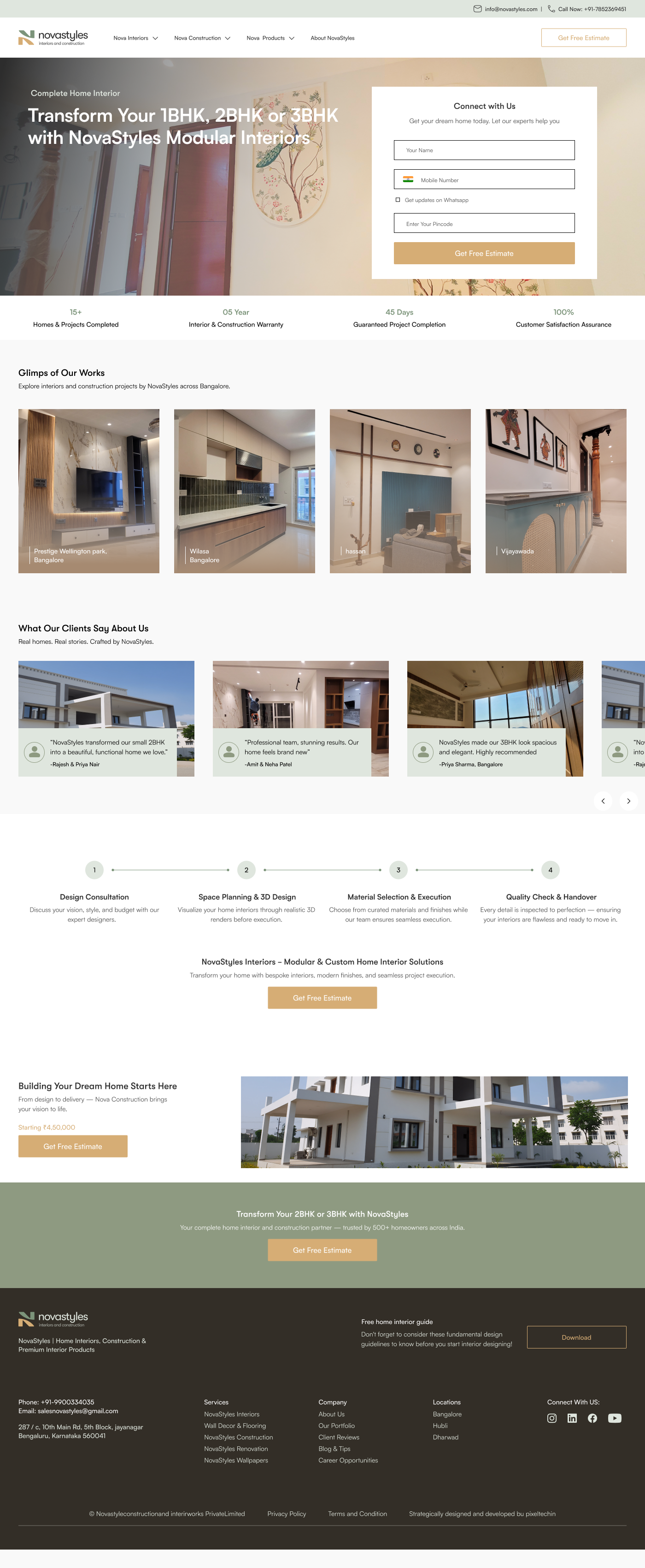
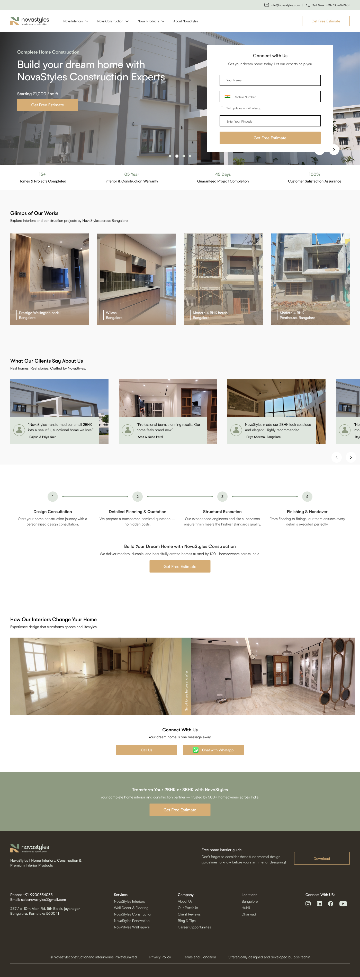
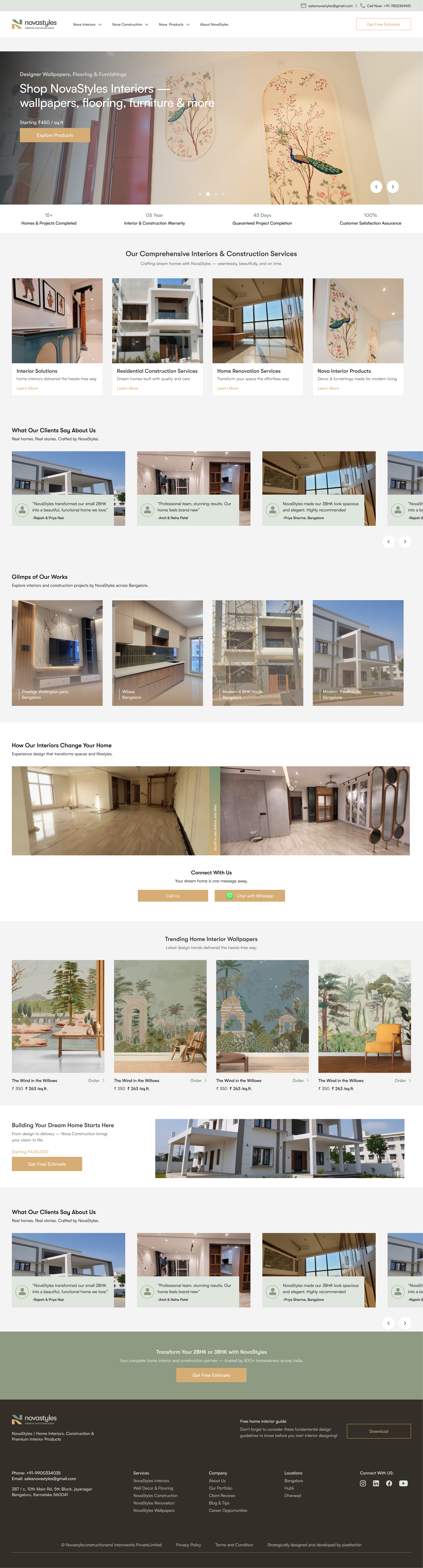
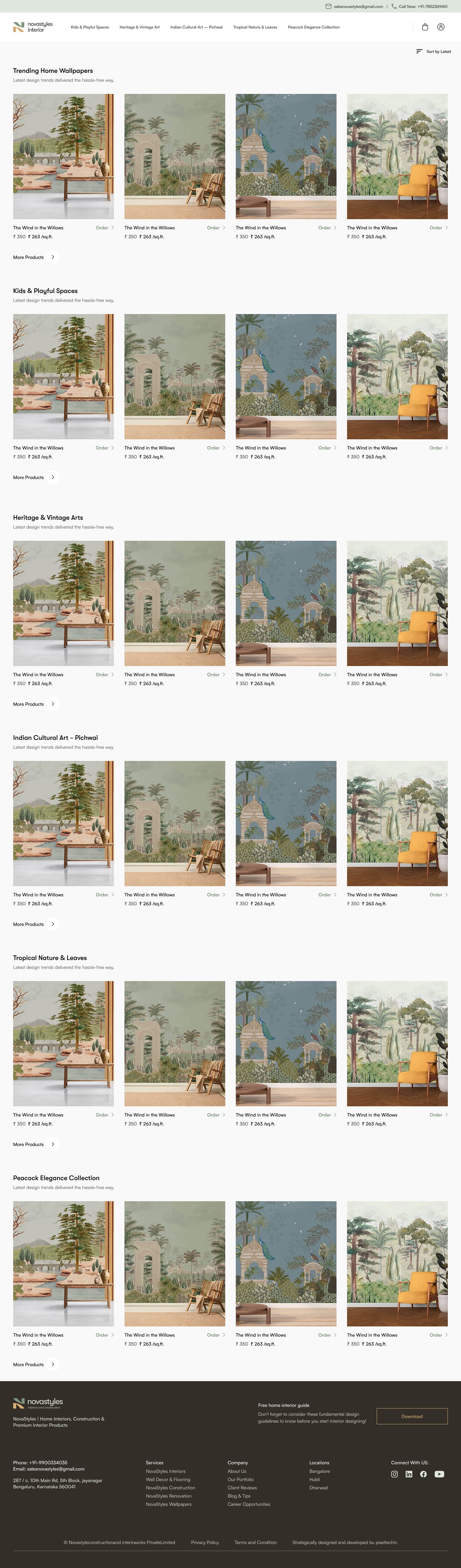
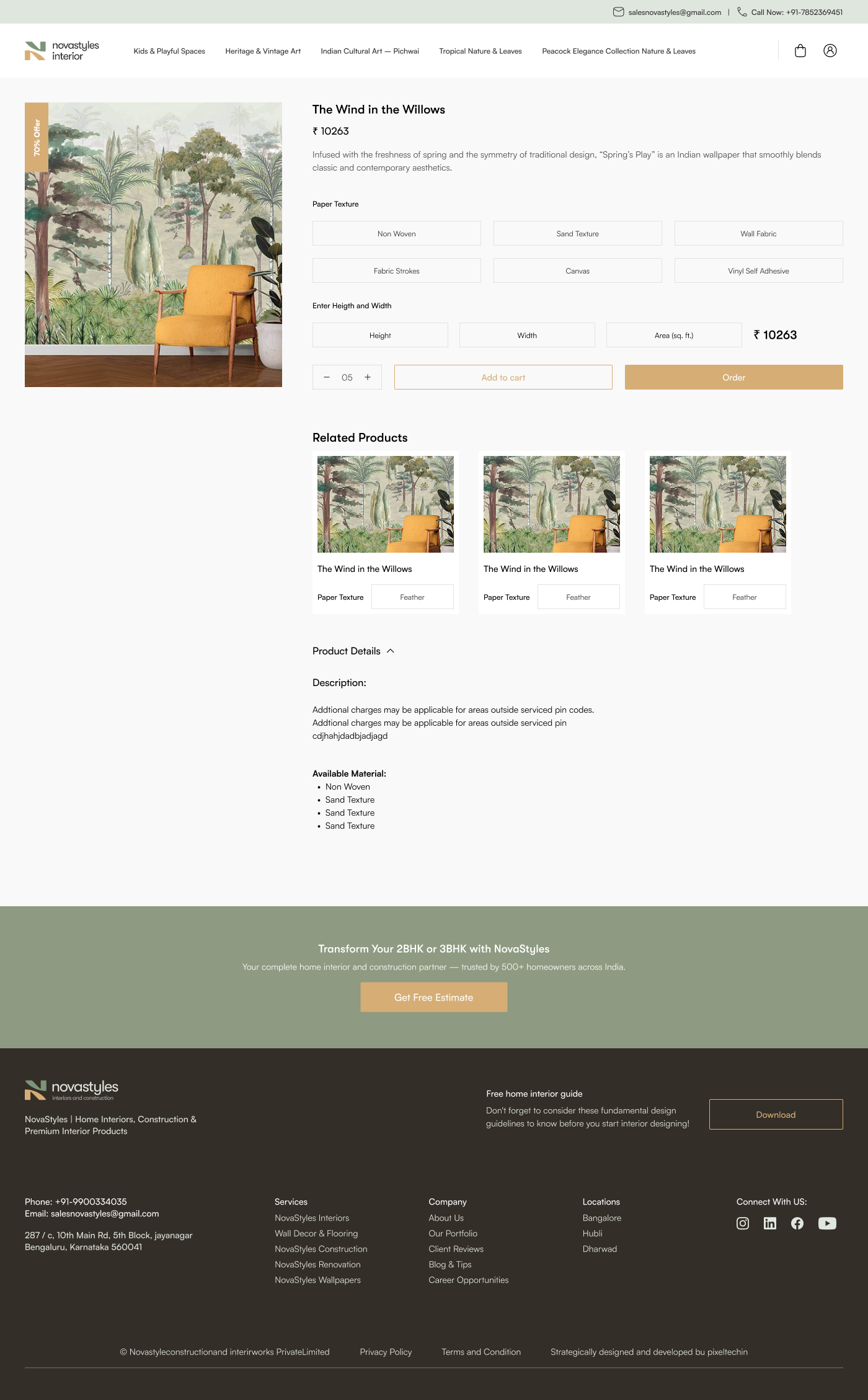
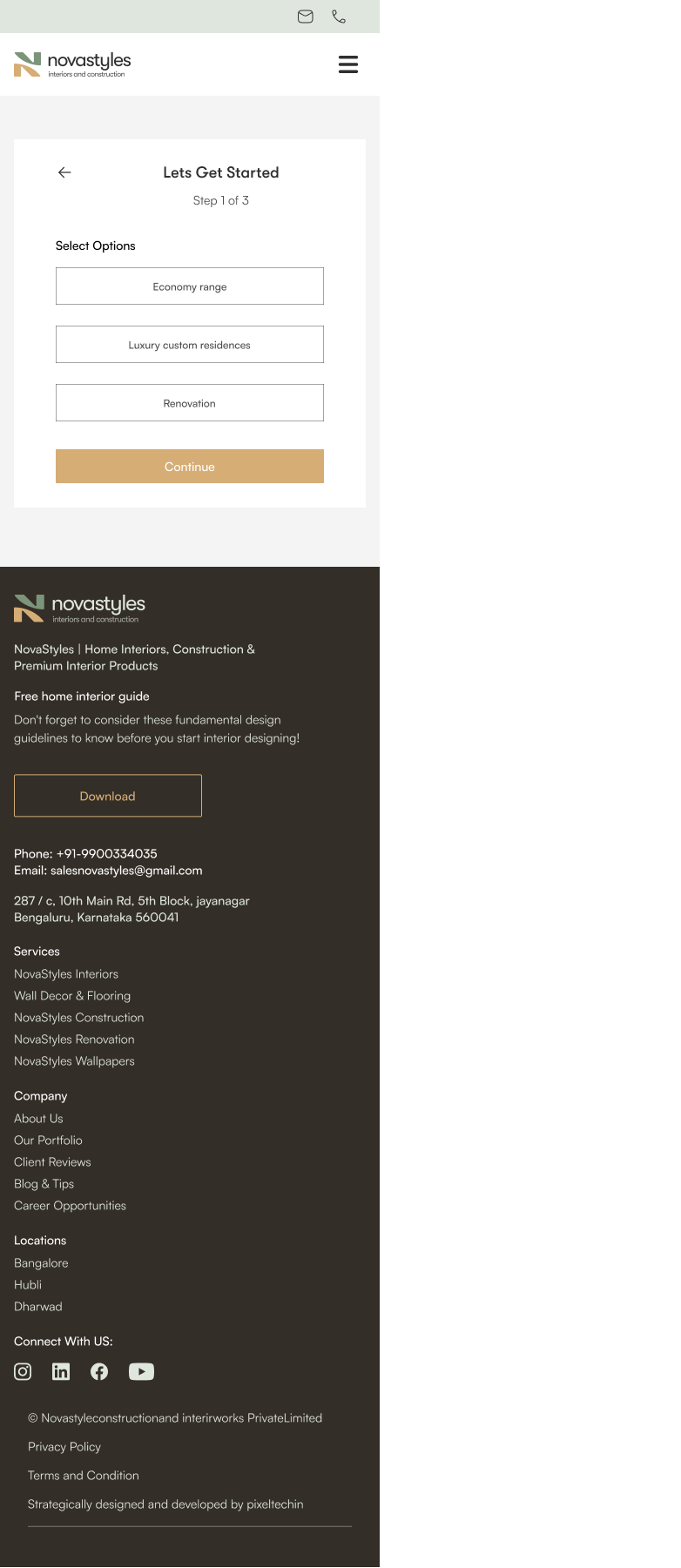
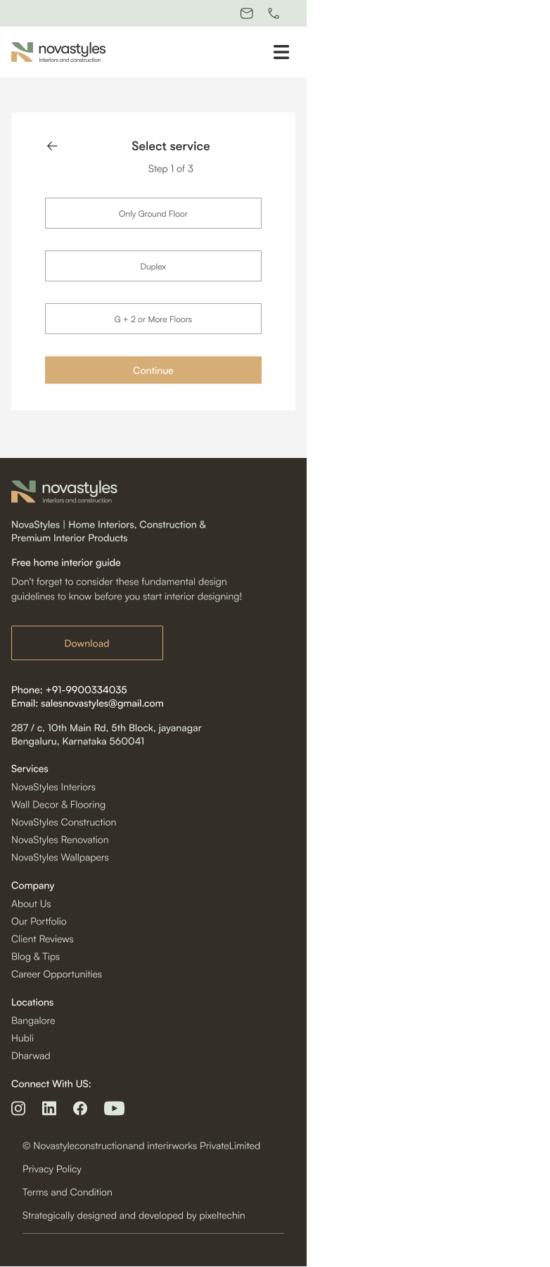
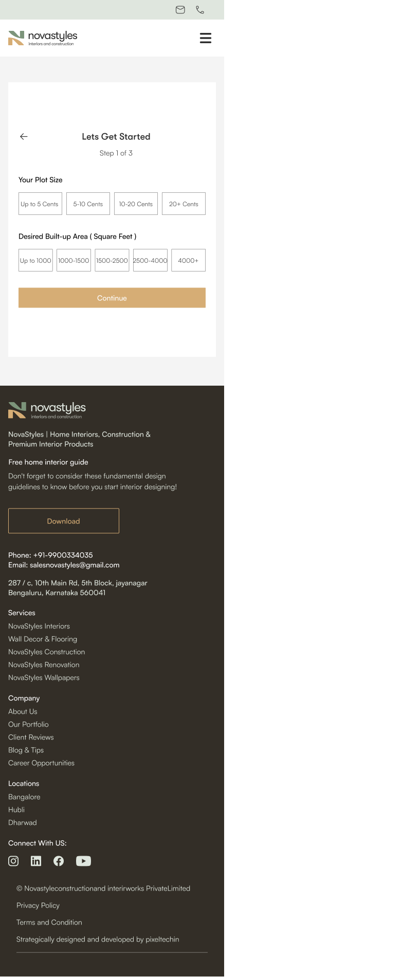
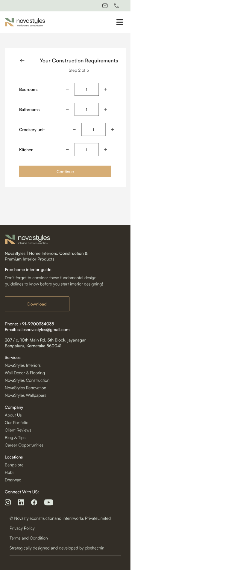
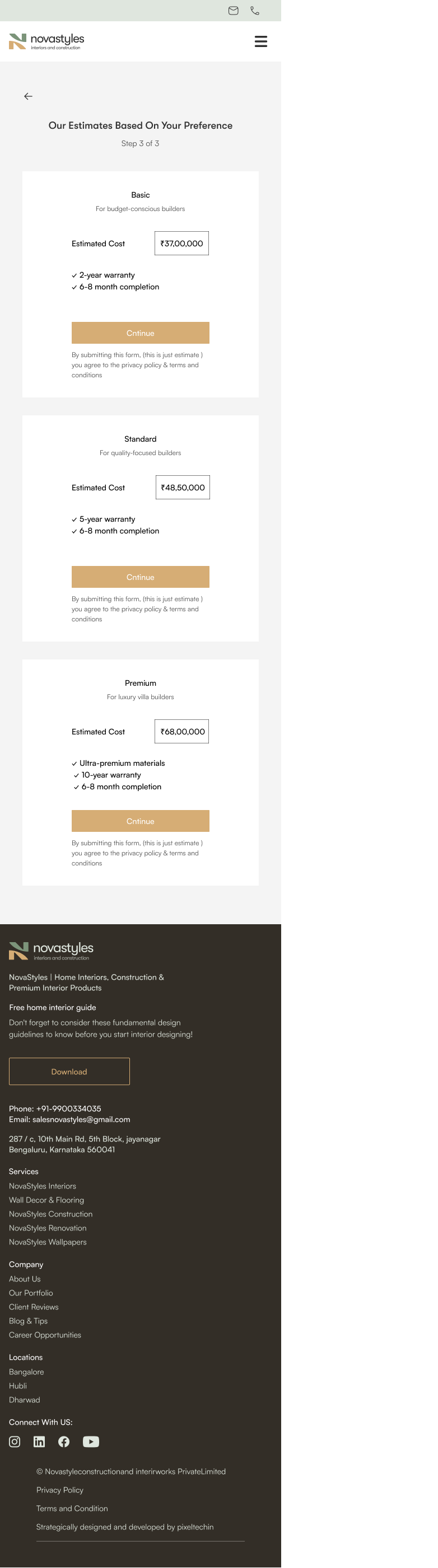
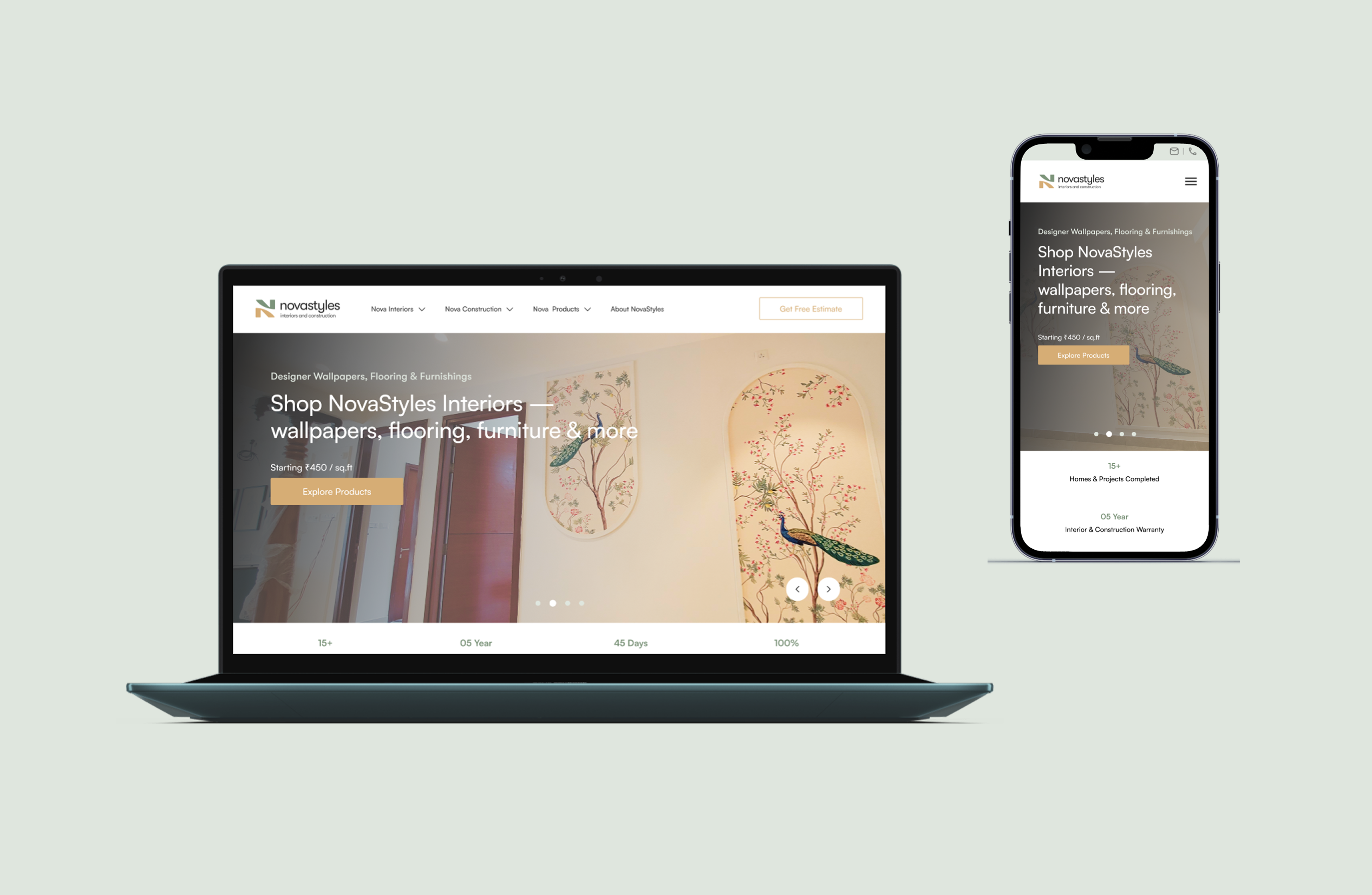
NovaStyles had a basic informational website. They needed a platform that could serve three distinct user intents — interior design, construction, and product e-commerce — without forcing everyone through the same funnel. I led the research, strategy, and design to transform it into a scalable, conversion-focused ecosystem.
NovaStyles is a Bangalore-based company offering interior design, construction, and premium home products. They had a basic informational website, but it wasn't converting visitors into leads. The site treated every user the same, regardless of whether they wanted a full home interior, a construction estimate, or just a wallpaper.
A basic website listing services. No clear user journeys, no estimation tools, no intent-based navigation. Every user landed on the same generic page regardless of what they were looking for.
A complete multi-intent platform with competitor research, user review analysis, information architecture, intent-based navigation, guided estimation flows, tiered pricing models, e-commerce integration, and 30+ responsive screens across desktop and mobile.
Before designing anything, I studied the top competitors in India's home interiors space. I wanted to understand what they do well, where users feel frustrated, and where there's a clear gap NovaStyles can own.
| Competitor | Strengths | Weaknesses |
|---|---|---|
|
|
Strong estimation tool, clear pricing tiers, modular kitchen focus. Good trust signals with project timelines. | Limited to modular interiors. No construction. Poor mobile experience for complex flows. Users report hidden costs not reflected in estimates. |
|
|
Large designer network, magazine-quality inspiration content. End-to-end project management dashboard for clients. | Overly complex onboarding. Users report long response times. No construction services. Premium pricing alienates budget-conscious users. |
|
Factory-built modular approach. Competitive pricing. Good at communicating manufacturing quality. | Limited geographic coverage. No e-commerce for standalone products. Website feels catalog-like rather than service-oriented. |
|
All three verticals in one platform — interiors, construction, AND e-commerce. Guided estimation for each. Intent-based navigation. | Newer brand — needs strong UX to compete on trust and usability against funded competitors. |
Every competitor focuses on a single vertical — either interiors OR construction OR products. NovaStyles' opportunity is to be the one platform that combines all three, but only if the UX can handle multi-intent navigation without overwhelming users.
I analyzed 120+ reviews from Google Play Store, App Store, and platforms like MouthShut, Trustpilot, and Google Business reviews for HomeLane, Livspace, and DesignCafe. Instead of guessing user pain points, I extracted them directly from real user feedback.
"Hidden costs everywhere" — Users report that the initial estimate shown online is significantly lower than the final bill. Add-ons, civil work charges, and material upgrades inflate costs by 30-40%.
"Post-sales nightmare" — Once the project starts, designer responsiveness drops. Users feel abandoned during execution phase. Project managers change mid-project.
"Good initial experience" — The estimation tool and 3D visualization make a strong first impression. Users appreciate seeing a price before committing to a meeting.
"Takes forever to get a response" — Multiple users report 3-5 day wait times after submitting interest. By then, they've already contacted 2-3 other companies.
"Premium pricing, average quality" — Users feel the brand premium doesn't translate to execution quality. Material choices are limited in lower-tier packages.
"Great design inspiration" — The magazine-style content and project galleries help users visualize what's possible. Strong brand trust from content marketing.
"No construction services" — Users who need both interiors and construction have to find separate contractors for civil work. No integrated offering.
"Transparent pricing" — Factory-built modular approach gives consistent pricing. Users appreciate knowing the exact cost upfront with fewer surprises.
"Quality of materials is good" — Users consistently praise the material quality. The manufacturing-first approach builds confidence in durability.
Key takeaway from user reviews: Users don't just want pretty designs — they want pricing transparency, responsive communication, and the convenience of getting everything from one platform. These became the three pillars of our product strategy.
HomeLane does interiors. DesignCafe does modular kitchens. Nobody does interiors + construction + e-commerce together. Users currently have to visit 3 different providers. NovaStyles can own the "one platform for everything home" position — but only if the UX doesn't feel like three different websites glued together.
67% of negative reviews across all three competitors mentioned hidden costs. Users want to see a number before they talk to anyone. The estimation tool isn't just a feature — it's the trust-building mechanism. If the first interaction asks for a phone number instead of showing a price, users leave.
A user looking for construction and a user looking for wallpaper have completely different journeys, timelines, and decision-making processes. The navigation needs to separate these at the top level — not dump everyone on one homepage with a generic "Our Services" section.
When users see "Economy / Standard / Premium" tiers with actual price ranges, they self-select into the right conversation. This reduces mismatched expectations (the #1 cause of negative reviews) and helps the sales team prioritize leads by budget level.
Competitors who offer products do it through generic Shopify-style stores that feel disconnected from their main service. NovaStyles' wallpaper and decor catalog should integrate seamlessly — the same navigation, the same design language, the same trust signals.
The IA was designed around user intent, not company services. Each vertical has its own entry point, its own estimation flow, and its own conversion path — but they all share the same navigation shell and design system.
Why this structure works: A user looking for wallpaper never has to scroll past construction content. A user needing a full home build never sees e-commerce product listings cluttering their journey. Each intent gets a clean, focused path — but the shared navigation makes cross-selling natural.
The original website had "Services" as one nav item with a dropdown. I restructured it into three distinct nav items — Nova Interiors, Nova Construction, Nova Products — each with their own dropdown menus. This tells users immediately that the platform serves different needs, not just one.
Instead of a long form asking for all details upfront, I designed a 3-step estimation flow. Each step asks one category of questions: what type of service, what are the specifications, and what's your contact info. Users see progress ("Step 1 of 3") and can go back at any point.
After the estimation steps, users see three price tiers with clear feature differences, warranties, and timelines. This was directly inspired by the #1 user complaint from competitor reviews: hidden costs. By showing all three tiers with real numbers, we set accurate expectations before any sales conversation.
The wallpaper and home decor e-commerce lives within the same platform, using the same navigation, footer, and design language. Users can browse products with the same level of detail — texture options, pricing per sq ft, and dimensional inputs for accurate pricing — all without leaving the NovaStyles ecosystem.
The home page introduces all three service verticals without overwhelming the user. The hero section communicates the "complete home solution" positioning, while distinct sections for interiors, construction, and products let users self-navigate based on their intent. The "Get Free Estimate" CTA is persistent across the entire platform.
The interior design page is designed for users who already know they want interior work. It showcases portfolio projects, explains the design process, and drives toward the estimation flow. The content is structured to build confidence: portfolio → process → pricing → CTA.
The construction vertical has its own dedicated landing page with a different content structure — project showcase, service types (ground floor, duplex, G+2), and a direct path to the construction estimation flow. The design communicates reliability and scale.
The e-commerce section lets users browse and purchase wallpapers and home decor products. Each product category is organized by design theme (Heritage & Vintage, Kids & Playful, Tropical Nature). Product detail pages include texture options, dimension inputs, and price-per-square-foot calculations — giving users accurate costs before purchase.
The product detail page goes beyond a basic e-commerce template. Users can select paper texture (Non Woven, Sand Texture, Wall Fabric, Canvas, Vinyl Self Adhesive), enter custom height and width dimensions, and see the total area and cost calculated in real-time. Related products are shown below to encourage browsing.
The 3-step estimation flow is the core conversion mechanism. Step 1 asks users to select their interest (Economy, Luxury, Renovation for interiors; Building Type for construction). Step 2 captures specifications (plot size, built-up area, room requirements). Step 3 delivers tiered pricing — Basic (₹37L), Standard (₹48.5L), and Premium (₹68L) — with clear feature and warranty differences.
Every screen was designed for both desktop and mobile viewports. The estimation flow, product pages, and service landings all adapt gracefully to smaller screens. The mobile navigation collapses into a hamburger menu while preserving the intent-based structure. Complex product configurators scale down without losing functionality.
The platform went from a basic informational website to a structured, conversion-focused ecosystem. Every design decision was backed by competitor research and real user feedback — not assumptions.
The old website was a digital brochure. The new platform has clear conversion paths for each service vertical — guided estimation flows that capture user intent, specifications, and contact info in a structured way that helps the sales team prioritize and respond faster.
By analyzing 120+ real user reviews from competitors, the design addressed actual pain points — pricing transparency (#1 complaint), response time (#2 complaint), and multi-service convenience (#3 request). This isn't a redesign based on "best practices" — it's based on evidence.
The platform's job is to match user intent to the right conversion path — interiors, construction, or products — within the first 3 seconds.
That was the core design principle. Every navigation, layout, and flow decision came back to this idea.