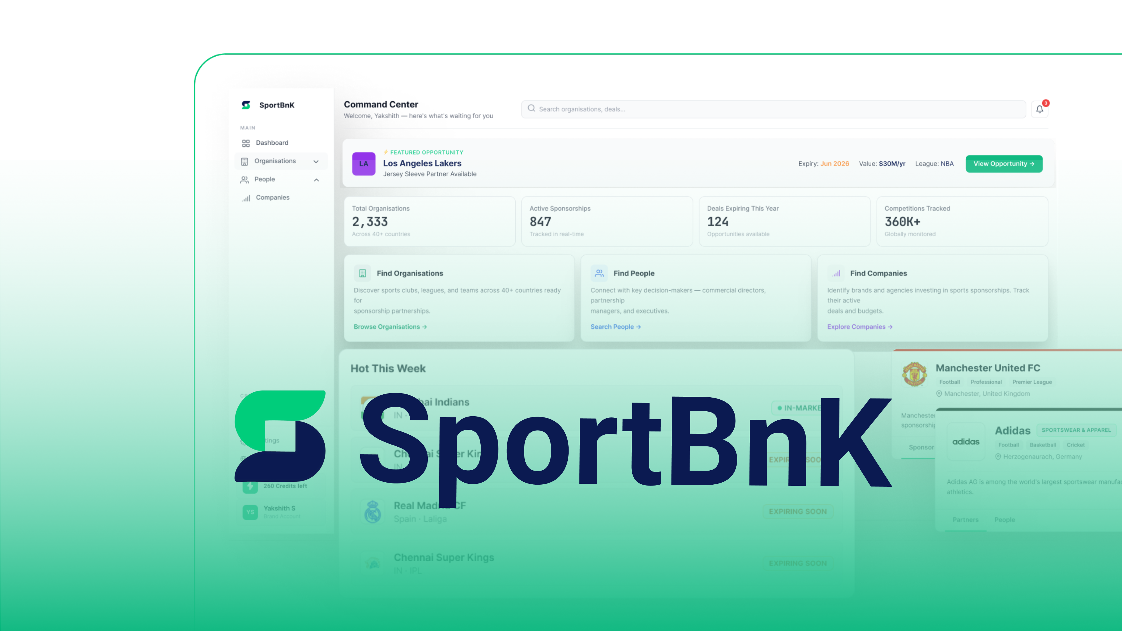
Sportbnk is an AI-powered sponsorship intelligence platform bridging brands, rights holders, and agencies. The industry runs on fragmented data and disconnected tools — this project turned that complexity into clarity through product thinking and information architecture.
I was brought in to redesign screens. Instead, I took ownership of the product direction — defining MVP scope, leading research, structuring the IA, and making the key decisions that shaped what Sportbnk became.
Redesign existing MVP screens. Make them production-ready for investors.
Competitor research, user interviews, MVP scoping, IA decisions, design system, 25+ screens, and a direction document.
Build a forward-looking intelligence platform — not another backward-looking database.
Before opening Figma, I spent time understanding the business, market, and users. Spoke with brand marketers, commercial directors at clubs, and agency leads — not to validate assumptions, but to understand where their workflows break down.
Users discover, evaluate, then act — in that order. The product needed to mirror this flow.
Everyone worked across spreadsheets, emails, and disconnected databases. No single tool covered discovery to deal management.
The biggest pain wasn't finding partners — it was knowing who was ready now.
I analysed four tools in this space. Every one focuses on past data — what deals already happened. None support forward-looking decisions or a complete discovery-to-deal workflow. That gap became Sportbnk's positioning.
| Tool | What it does | What it doesn't do |
|---|---|---|

|
Tracks sponsorship deals and has a large database of clubs and brands | No signals, no CRM, mostly US-focused, only shows historical data |
|
Measures ROI on deals that have already happened | Only works after a deal is signed — no value before the deal |

|
CRM for clubs and leagues to manage their sponsor relationships | Built only for rights holders — brands and agencies cannot use it |

|
Marketplace connecting brands with athletes | Athletes only, completely different market from what Sportbnk is doing |
|
|
Discovery + signals + contact unlock + CRM in one place | The only tool that combines all of this for all three user types globally |
The hardest part of an MVP is deciding what to leave out. Five things that work well beats fifteen that feel half-finished. Every feature had to directly serve the core journey: discover → evaluate → act.
Not a monetisation afterthought. Browsing is free, unlocking contact details costs one credit. I placed the gate at the People tab — the moment of highest intent.
Where something sits in navigation tells users what the product thinks is important. Signals are the differentiator — they can't be buried in a dashboard widget.
Sponsors tab (free) and People tab (credit gate). User intent is sequential — evaluate first, then contact. One journey, not two.
A dashboard summarises a product. Designing it before understanding the product means summarising assumptions, not real needs.
Without retention, the platform is an occasional tool. More partners = more relevant signals. This creates a retention loop, not just a discovery tool.
Every screen traces back to a research insight or strategic decision. The design follows how users think — not how data is organised.
Clean, minimal onboarding — get users to their first "aha moment" fast. Account type selection (Buyer vs Seller) sets the right context from the start.
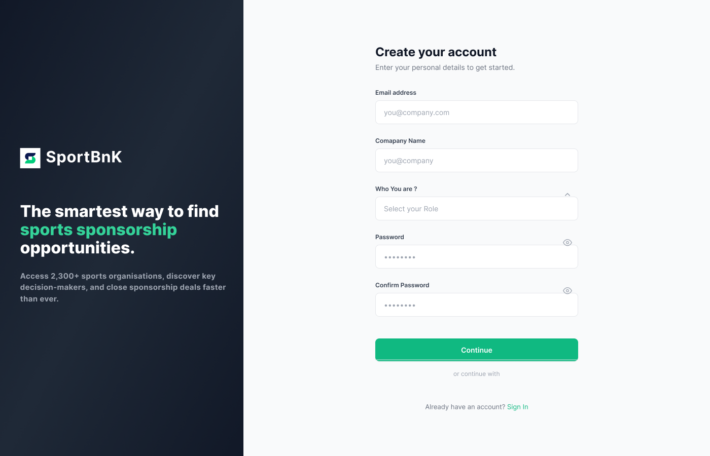 Account creation — clean, focused inputs
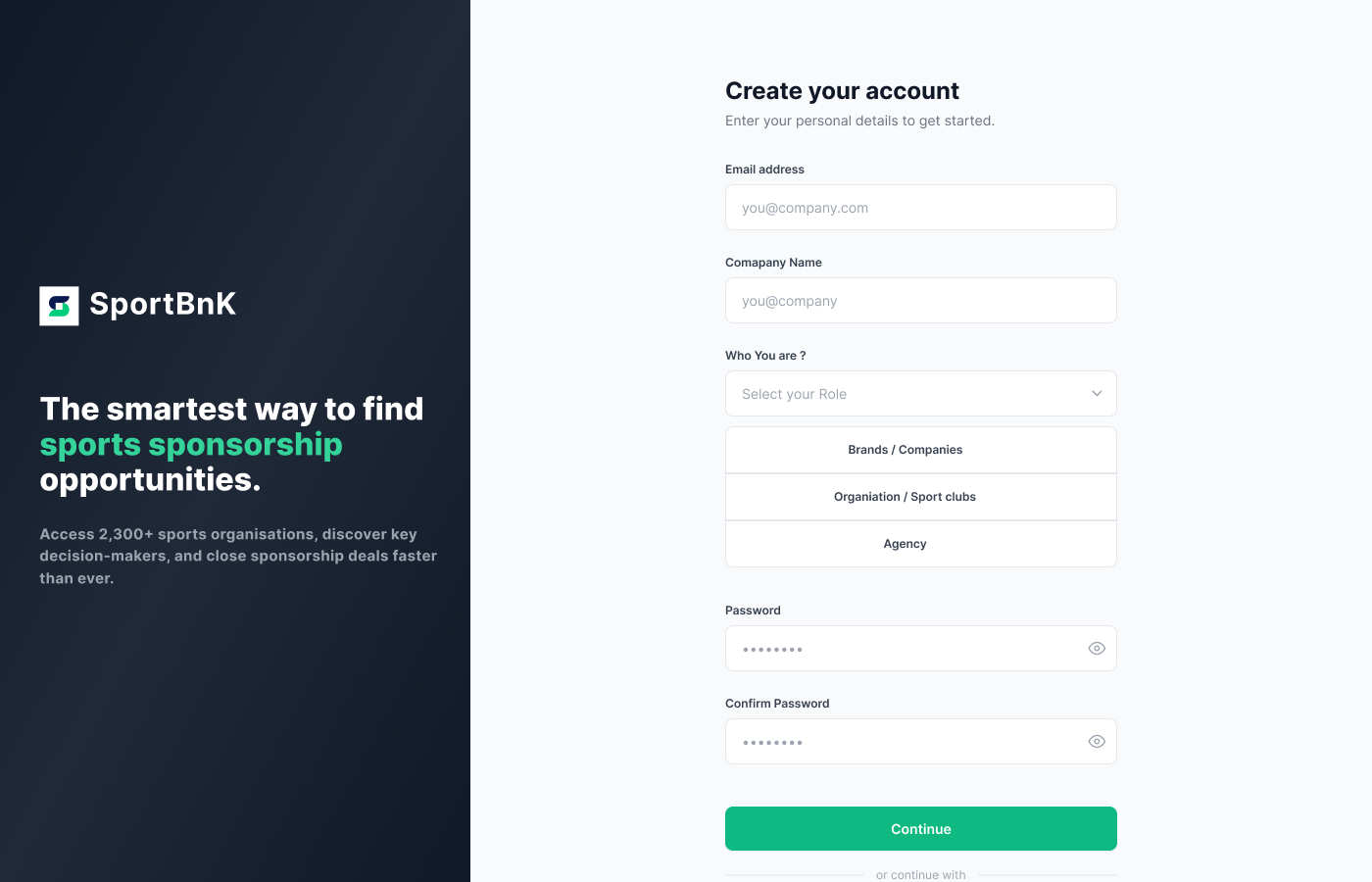 Account type selection — Buyer vs Seller context
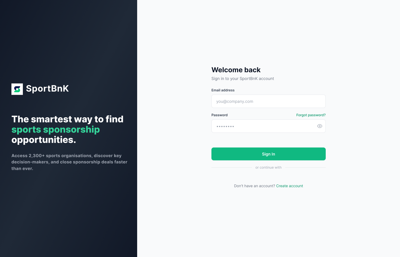 Login — consistent visual language across auth flow
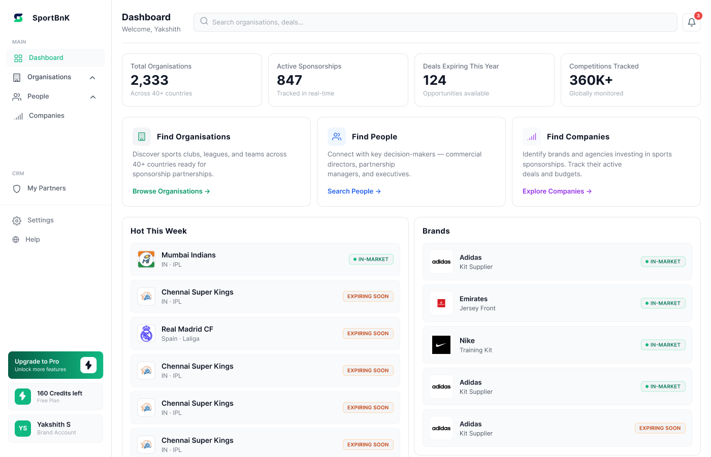
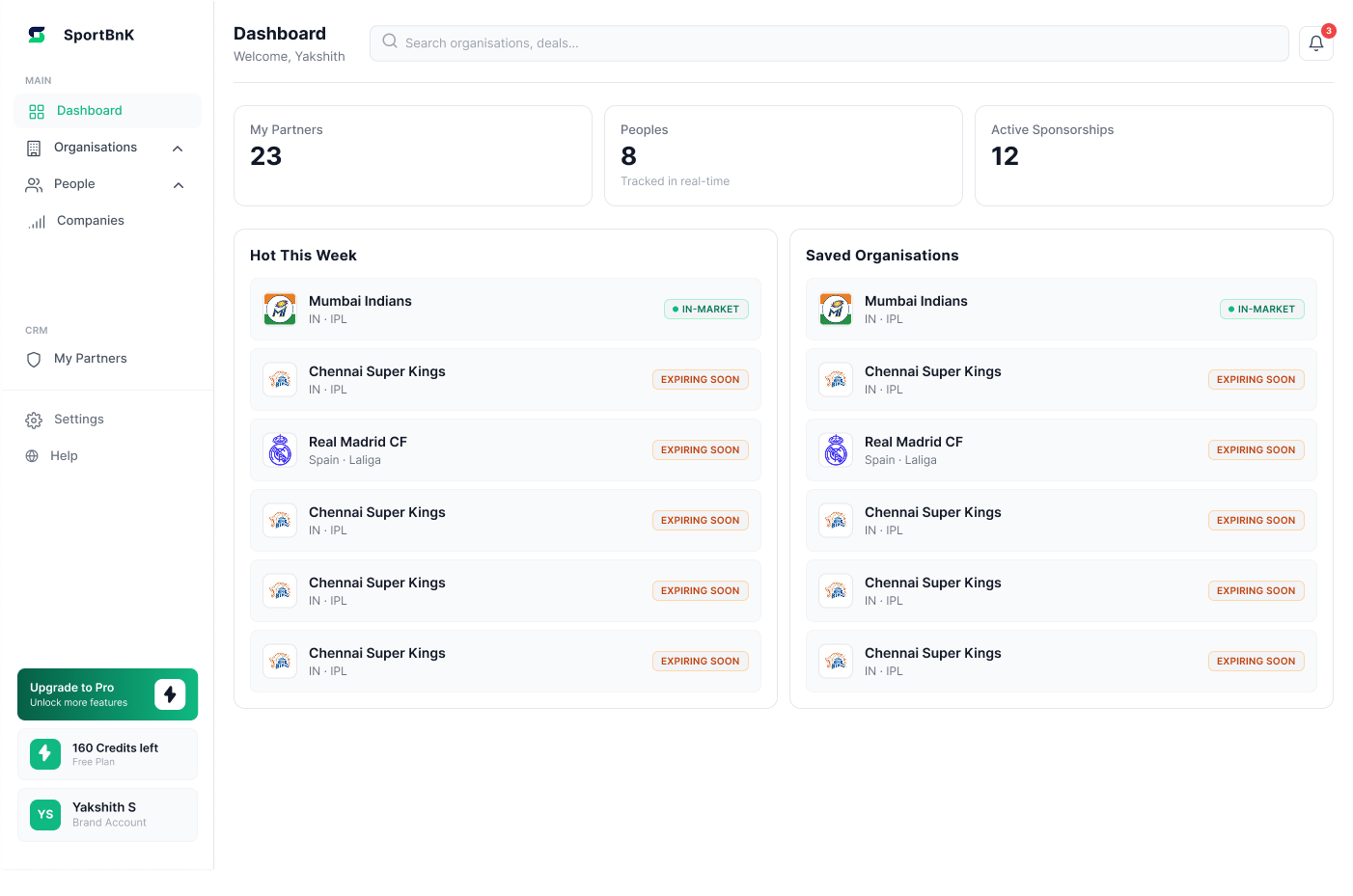
A dashboard summarises a product. It was designed after all other screens were complete, so it reflects real user journeys — not assumptions. Different states for new users, returning buyers, and sellers.
 New user state — guided first experience
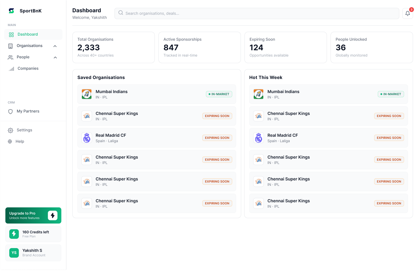 Returning user — Buyer
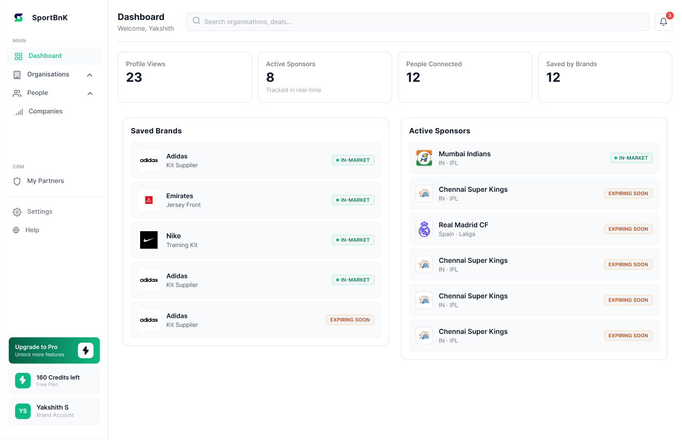 Returning user — Seller
 Empty state — subtle nudges
 Organisations widget
 Saved people widget
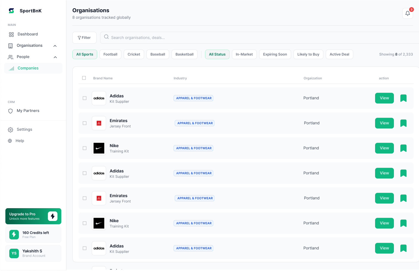
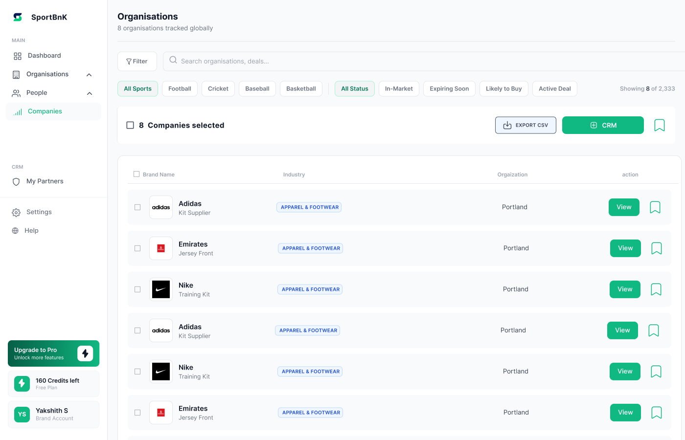
The main discovery view for brands. Filterable by sport, status, and deal type. Columns follow how brands actually evaluate — not how the database is structured.
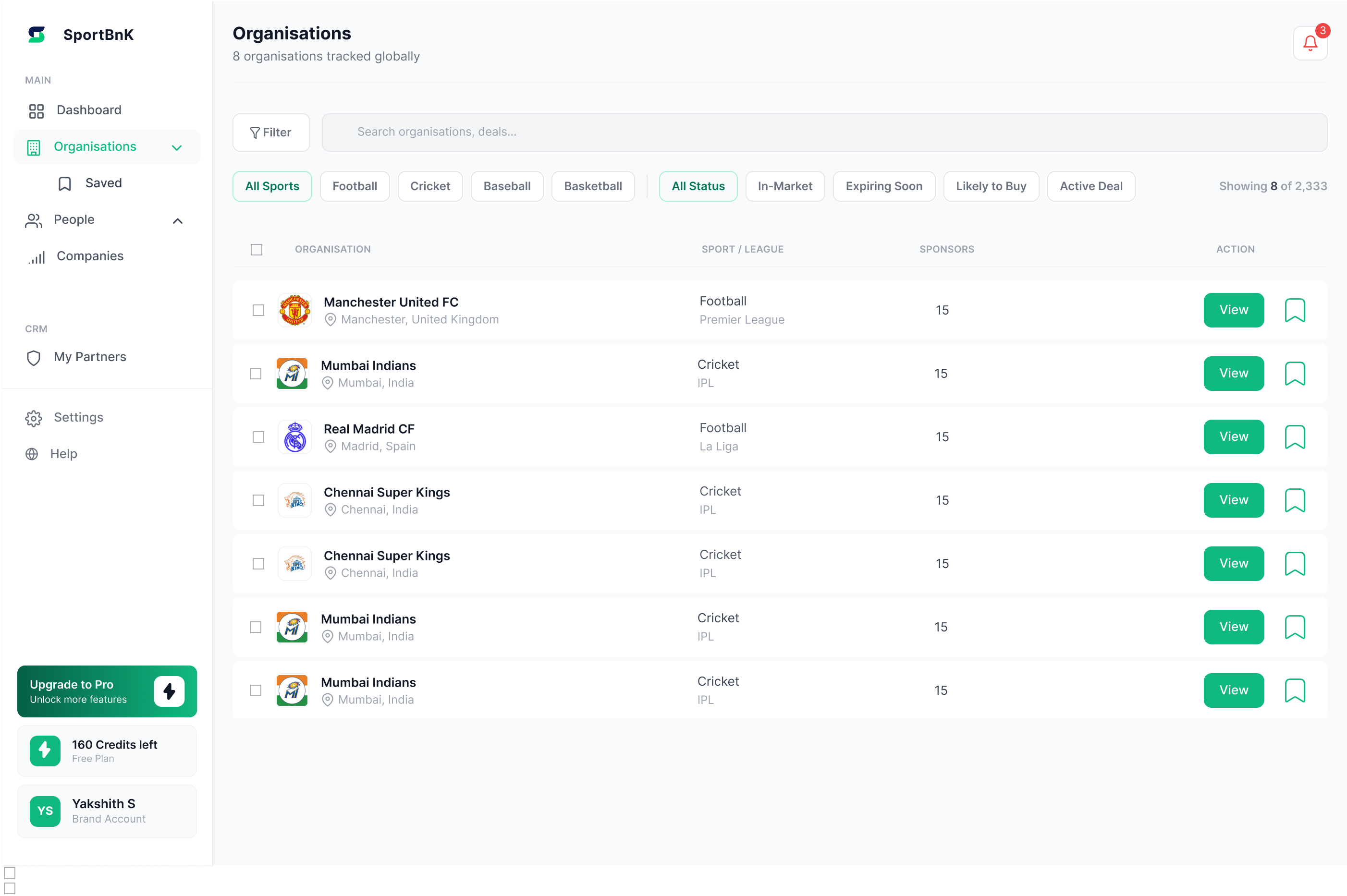 Organisations list — filterable by sport, status, and deal type
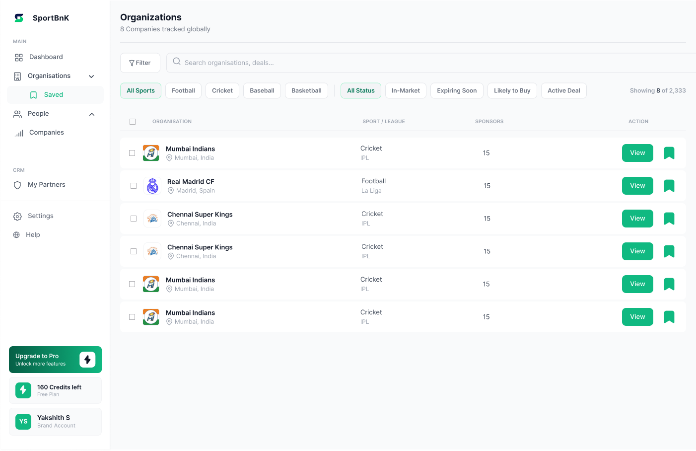 Saved organisations — quick access to bookmarked clubs
Sponsors tab shows current deals and categories (free). People tab is where the credit gate sits — the moment of highest intent. Users have already evaluated and identified the right person before they pay.
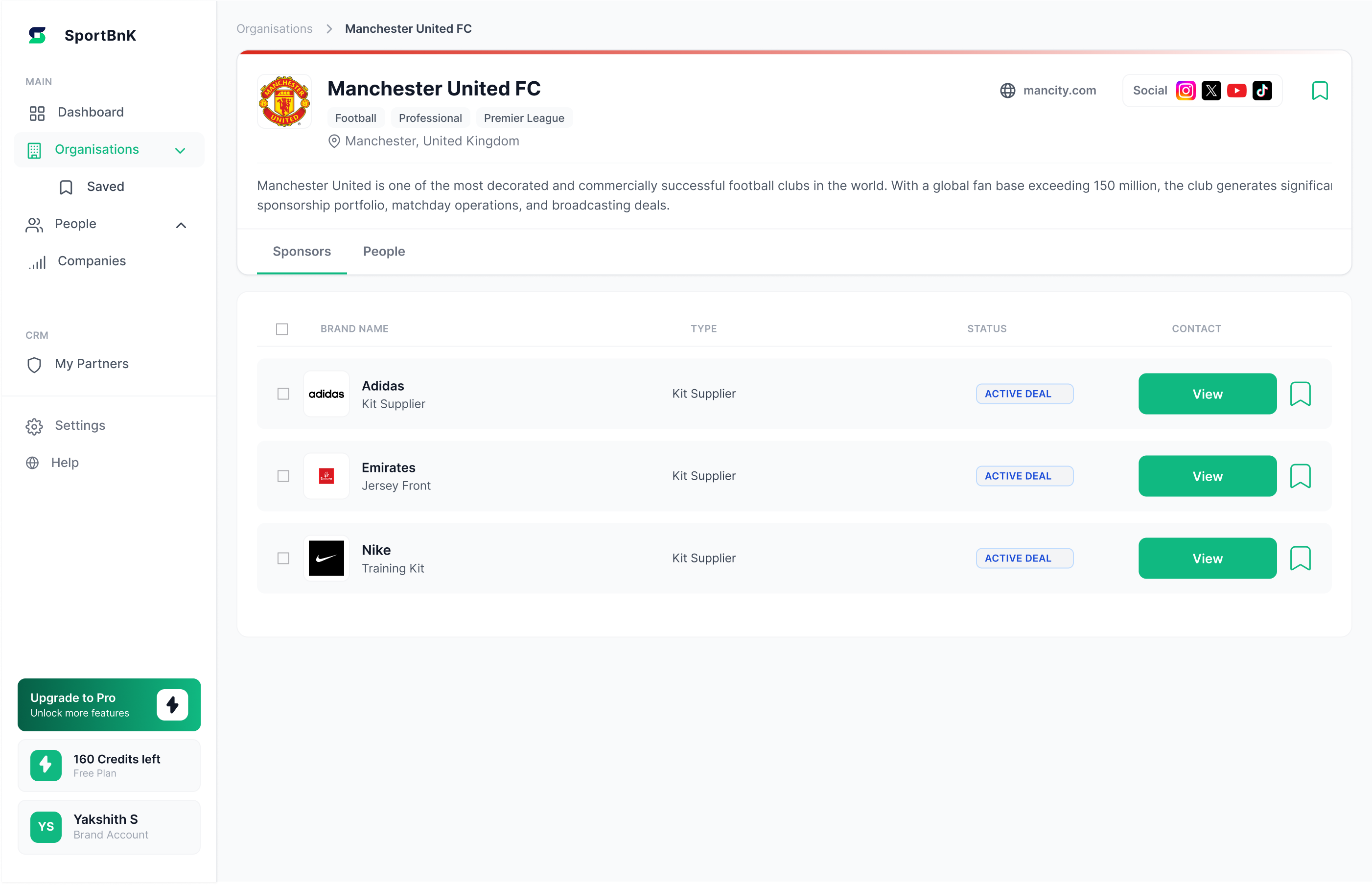 Sponsors tab — free. Current deals, brand names, types, status
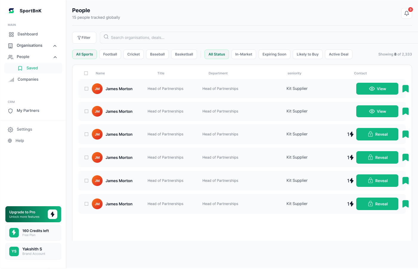
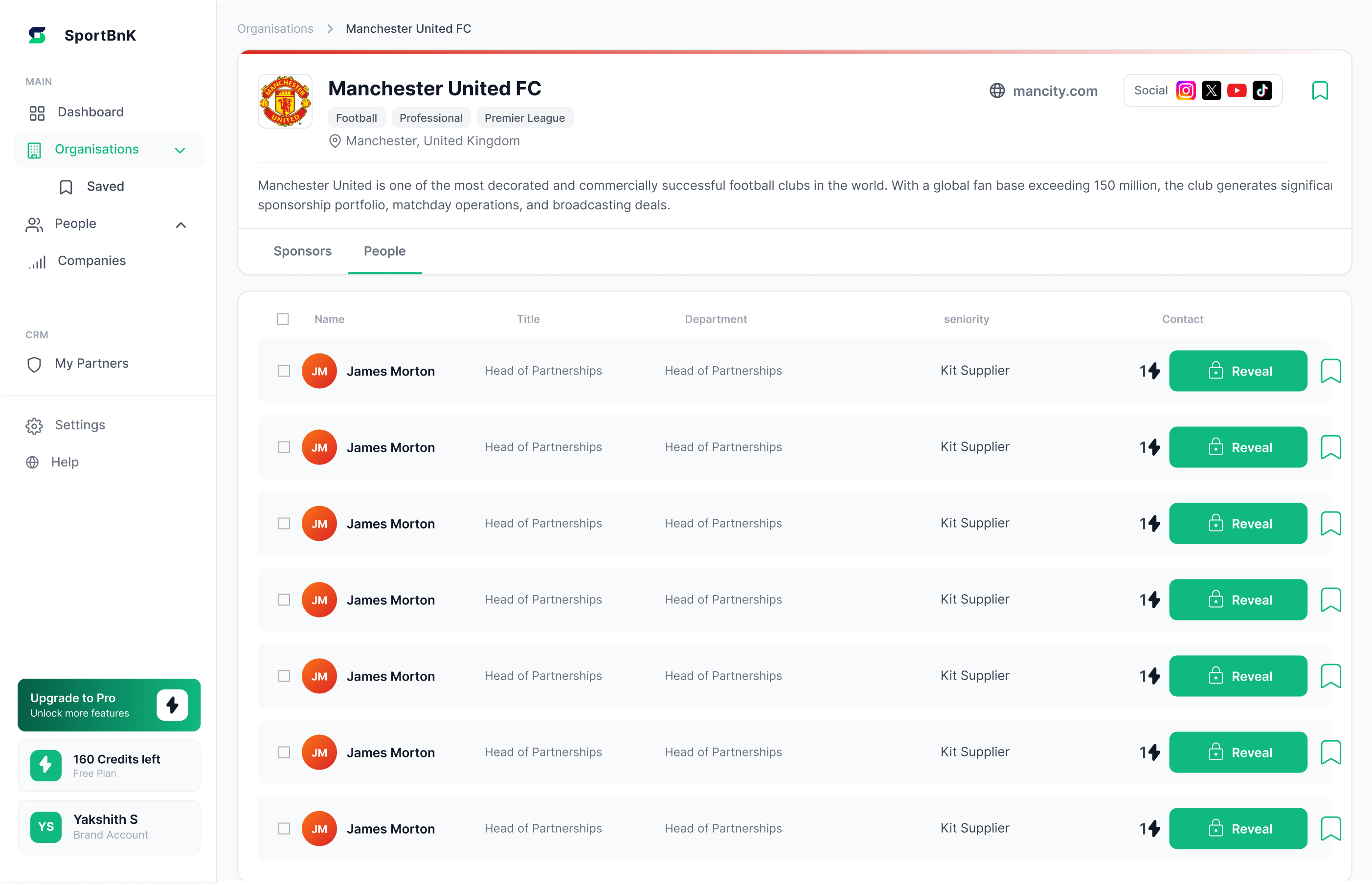 People tab — decision-makers listed, "Reveal" button costs 1 credit
Shows enough to make a contact worth unlocking — name, role, tenure — without revealing details. One credit unlocks the full profile. Users see masked data first, confirming intent before spending.
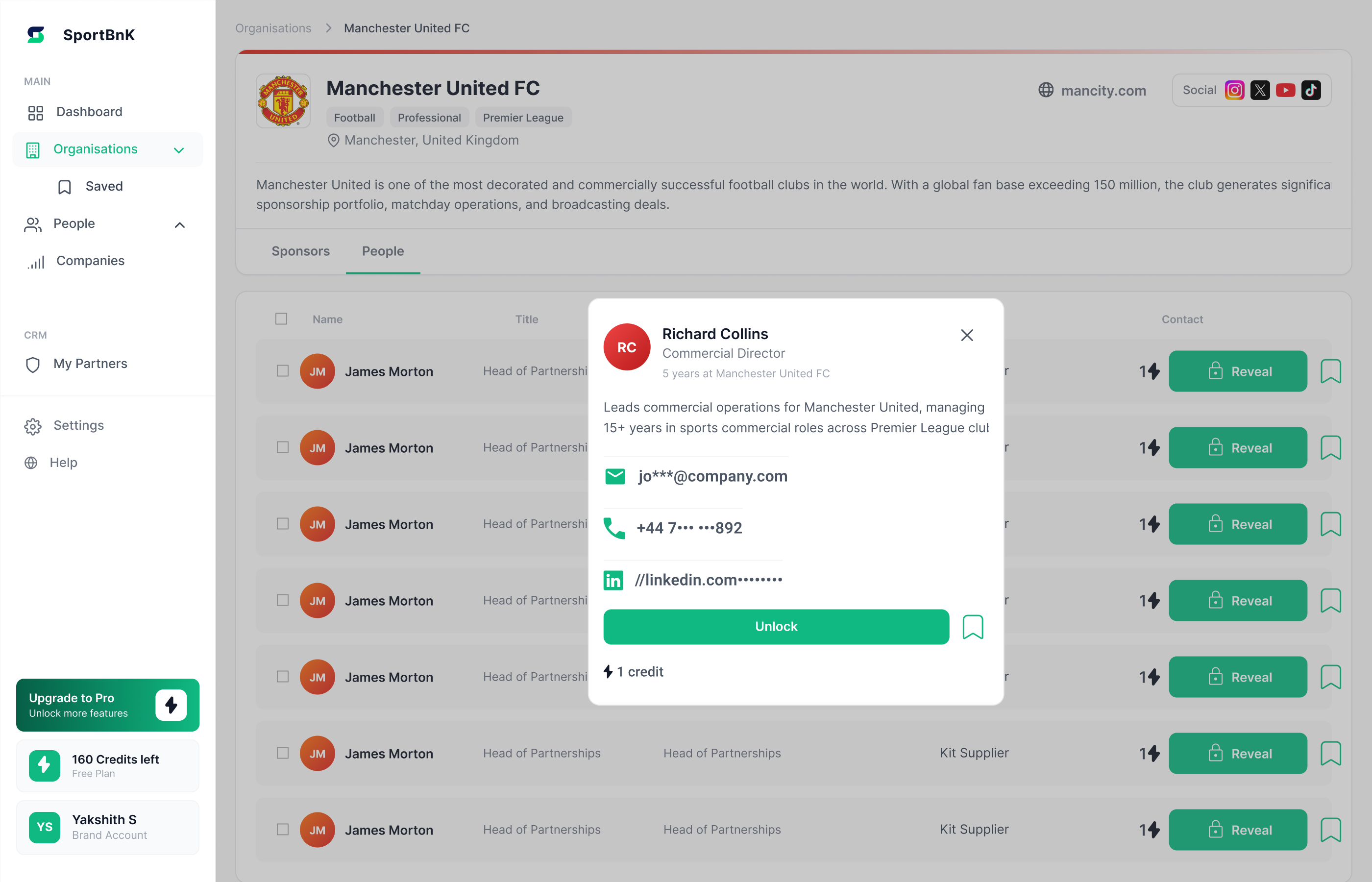 Locked state — masked email, phone, LinkedIn. "Unlock" CTA
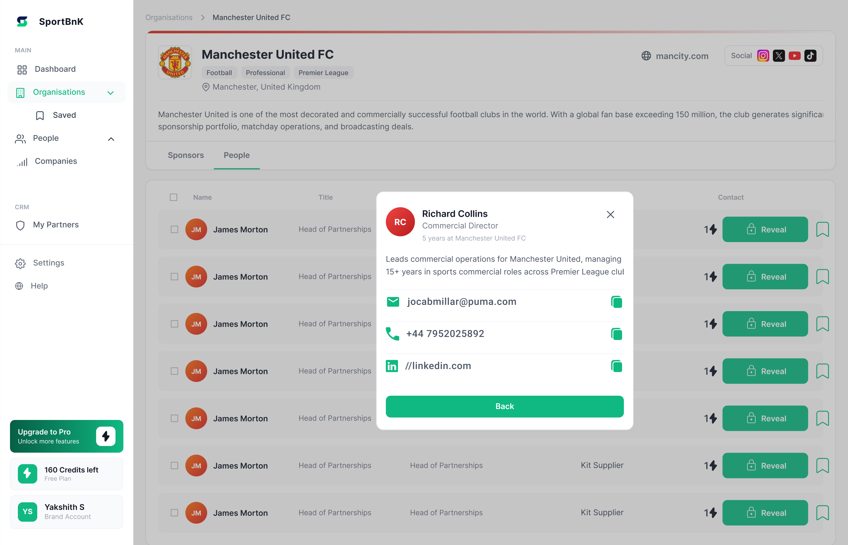 Unlocked state — full contact details revealed, copy-ready
Mirrors Organisations for rights holders browsing brands. A club looking outward and a brand looking inward have different mental models — one view would confuse both.
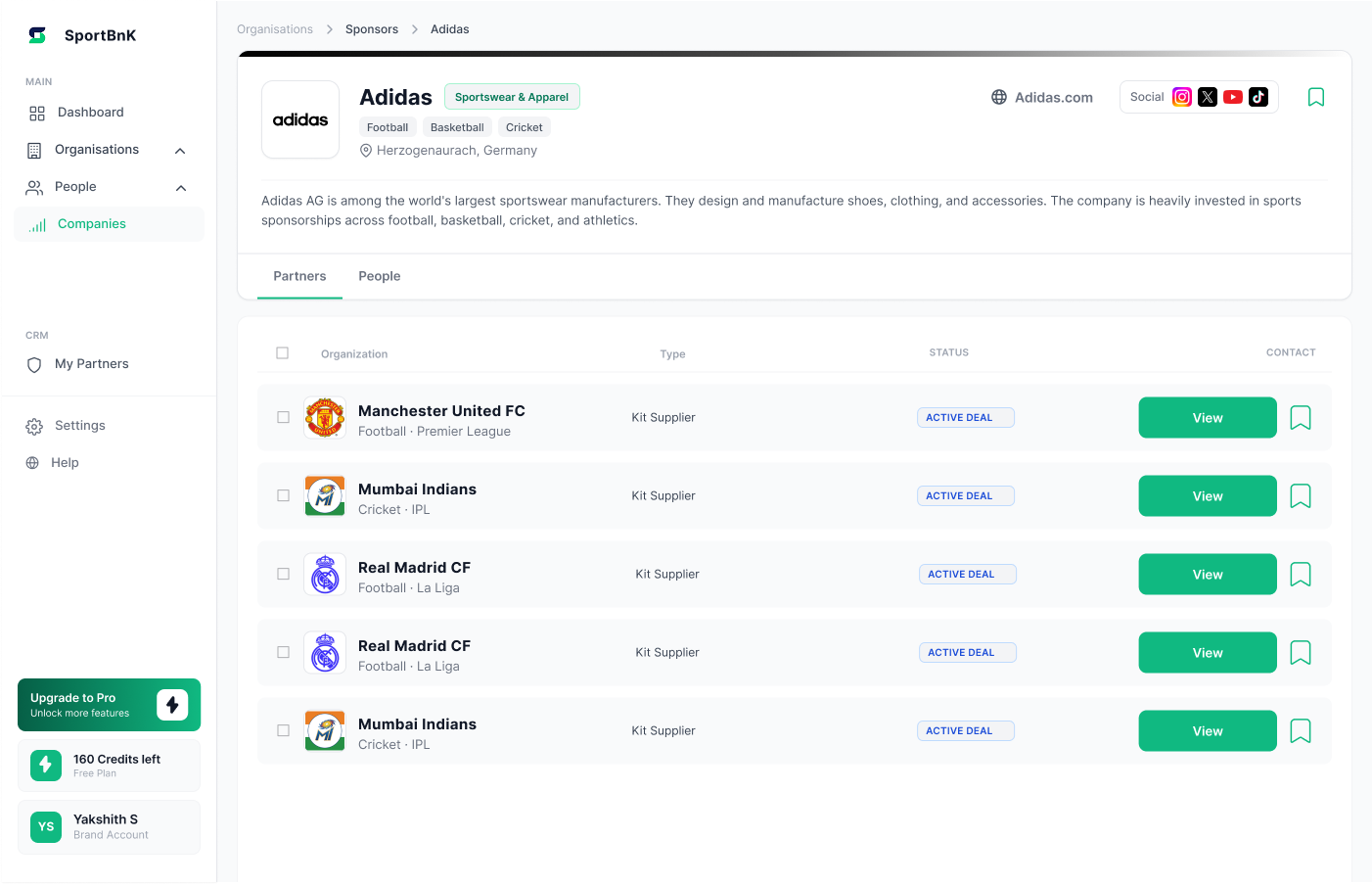 Companies view — brand discovery for rights holders
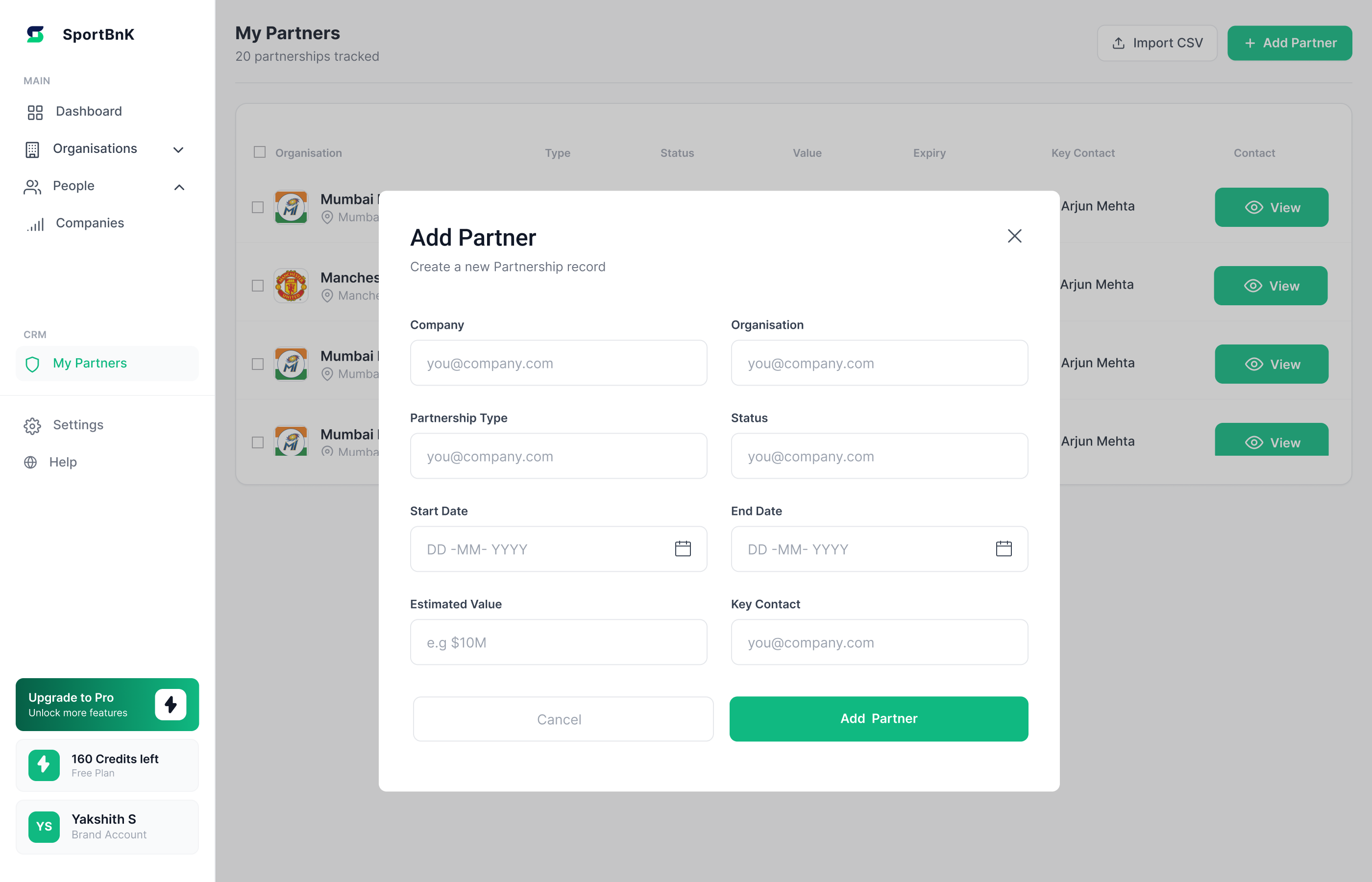
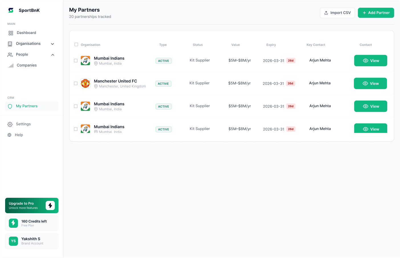
Without CRM, Sportbnk is an occasional search tool. With it, users manage relationships daily. More partners = more relevant signals — a retention engine, not a nice-to-have.
 My Partners — manage partnerships, track deals, monitor expiry dates
 Add Partner — import CSV or add manually
 Bulk selection — manage multiple partnerships at once
Clear, upfront credit balance and plan details. Upgrading is seamless and focused on delivering immediate value (credits).
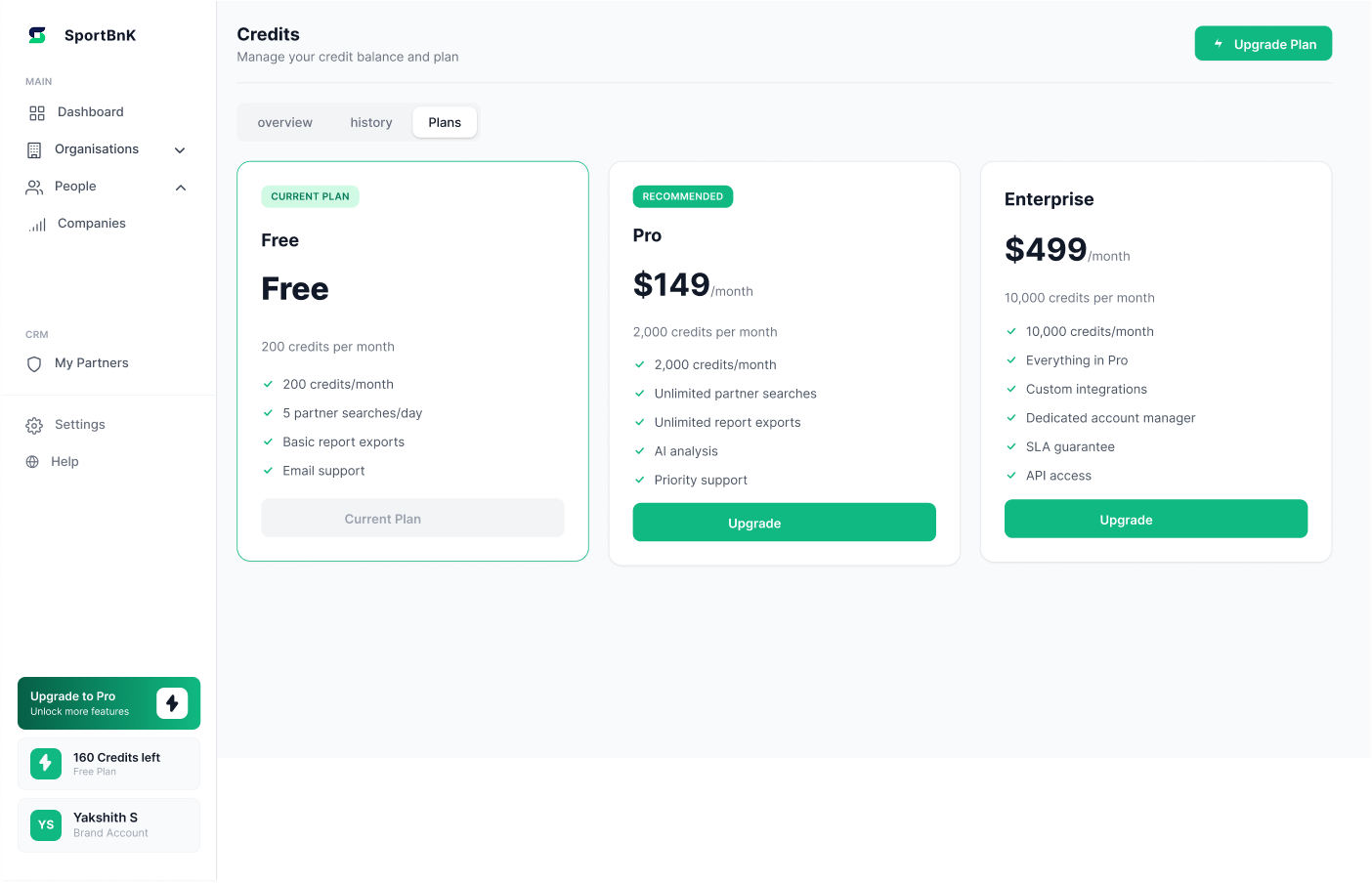 Credits page — managing plan and balance
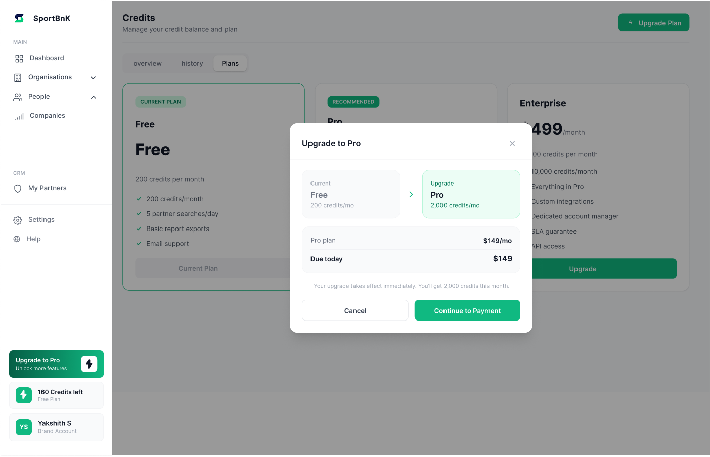 Upgrade plan — step 1
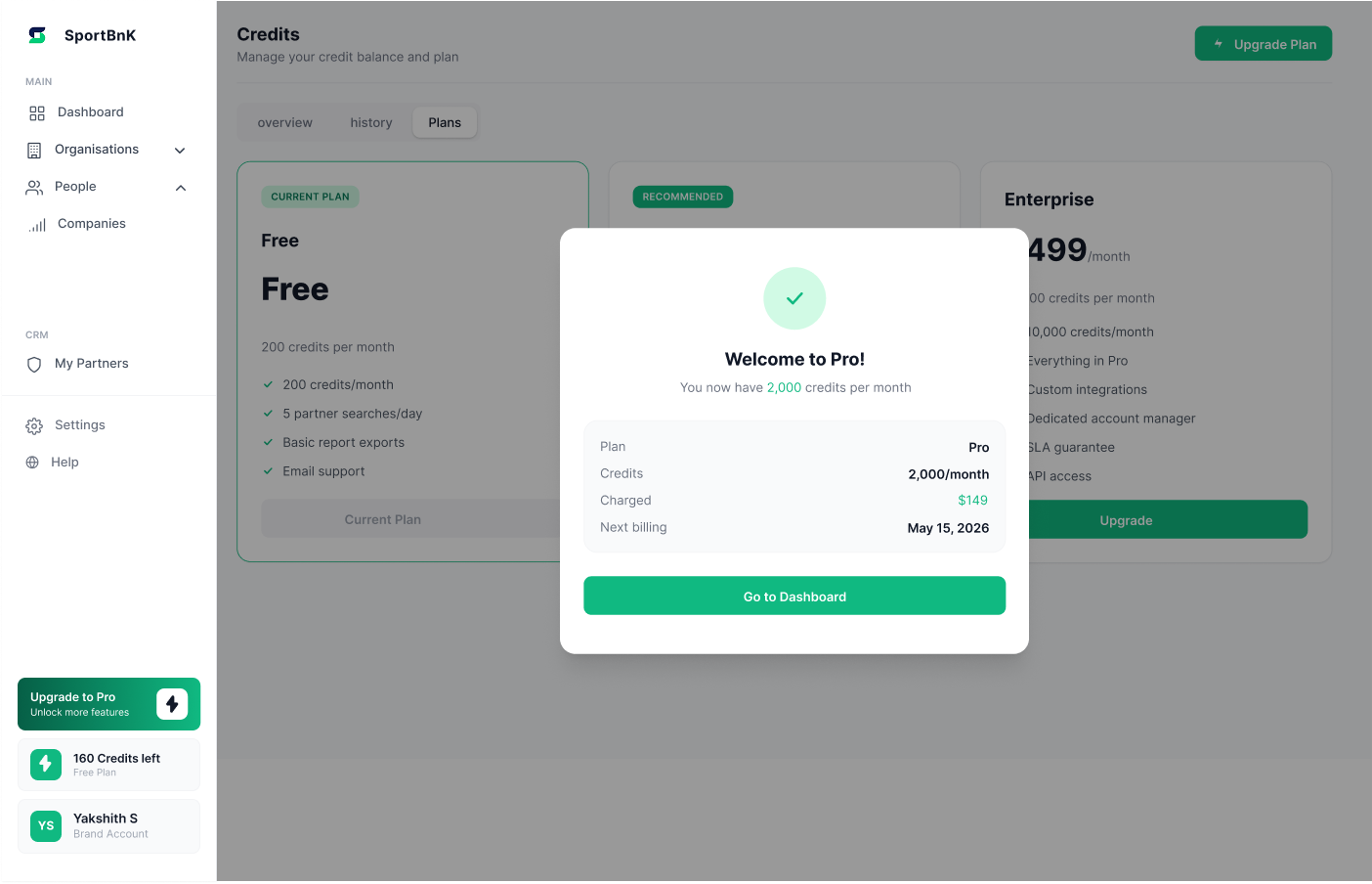 Upgrade plan — payment confirmation
The value wasn't just the screens — it was the clarity. Research, strategy, and product decisions gave Sportbnk a coherent investor story and a beta-ready experience.
Figma prototype and direction document were used directly in fundraising. Research became the pitch narrative — not just "here's an app" but "here's why this product exists."
Defined what Sportbnk is, not just how it looks. Positioning, credit model, and IA decisions gave a clear story beyond the MVP.
Ready for first 10 users without additional design work. Focused enough to feel complete, with a clear path from discovery to action.
Covering positioning, user types, IA rationale, and roadmap reasoning. Became a reference for engineering and future planning.
The platform's job is to tell you what to do next — not just show you data.
Every decision in Sportbnk came from that single insight.